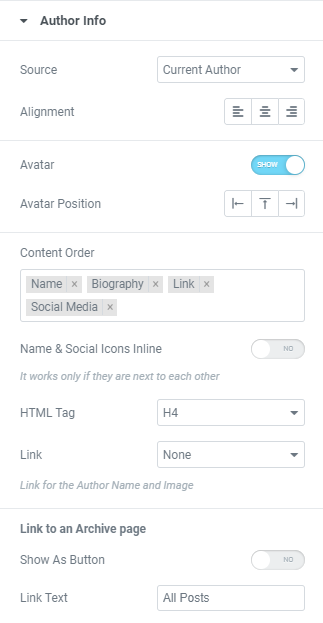
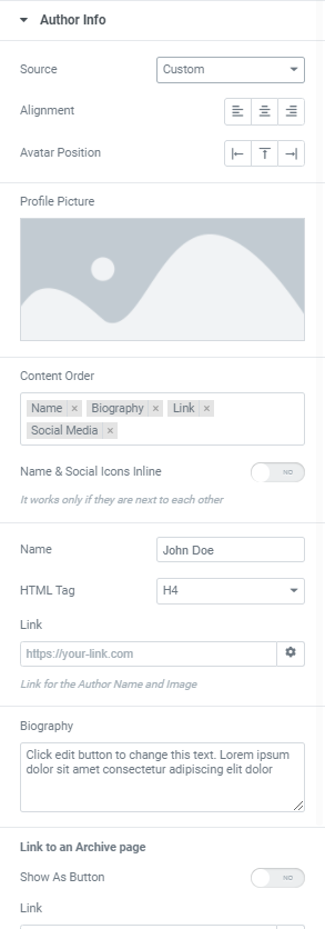
Alignment: Choose between Left, Center or Right author info alignment.
Avatar: Slide to SHOW to display the gravatar.
Avatar Position: Choose between Left, Top and Right positions.
Content order: Set Name, Biography, Link and Social media in a desired order.
Name and Social Icons Inline: Slide to YES to display Name and Social Icons Inline.
Please note that this setting can be used if in a Content Order setting you choose to display Name and Social icons next to each other.
HTML Tag: Choose an HTML Tag for your Author.
Link: Link the Author Name and Image to your website or your post archive. When using Custom – enter your own link.
Link to an Archive page
Show as Button: Slide to YES to show link as a button.
Link Text: Add desired text here.