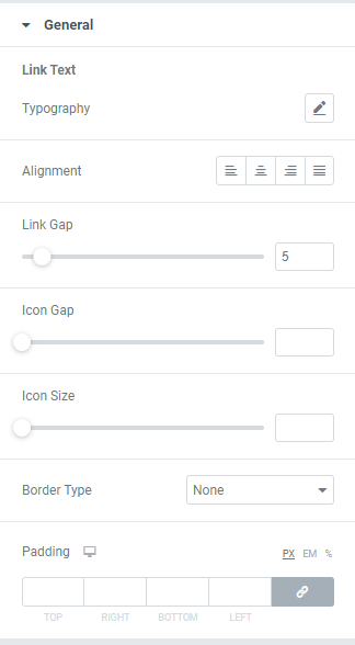
Authorization Links Widget

Use the Auth links to provide an easy way to authorize the visitors on your website.

Content

Log In/Register

Login

Slider to YES to show a Login link and add a Login page URL.

Add desired Login link Text and Prefix Text (text used before Login link) and choose the Icon from the Icon library or upload desired SVG.

Register

Slider to YES to show a Register link and add a Register page URL.

Add desired Register link Text and Prefix Text (text used before Register link) and choose the Icon from the Icon library or upload desired SVG.

Log Out/Account

Log Out

Slider to YES to show a Logout link and add a Redirect After Logout page URL.

Add desired Log Out link Text and Prefix Text (text used before Log Out link) and choose the Icon from the Icon library or upload desired SVG.

Account

Add My Account page URL, My Account link text and and Prefix Text (text used before My Account link) and choose the Icon from the Icon library or upload desired SVG.

Additional options

Reverse: Slide to YES to reverse the links.

Separator: Slide to YES to add a Separator between links.

Style

General

Link Text

Typography: Set a Typography using settings from the dropdown.

Alignment: Choose a Link Text Alignment between Left, Center,Right or Justify.

Link Gap: Set a Gap between links.

Icon Gap: Set a Gap between Icon and Link.

Icon Size: Set desired Icon size.

Border Type: Choose a Border Type from the dropdown and set it.

Caption Padding: Set a Link Text padding for desktop, tablet and mobile.

Login

You can set both Normal and Hover modes.

Color: Choose a Login link color from a color palette or dynamic tags.

Icon Color: Choose an Icon color from a color palette or dynamic tags.

Background color: Choose a Login link background color from a color palette or dynamic tags.

Box Shadow: Choose desired settings from the dropdown.

Border Radius: Set Border Radius to buttons.

Log Out

You can set both Normal and Hover modes.

Color: Choose a Logout link color from a color palette or dynamic tags.

Icon Color: Choose an Icon color from a color palette or dynamic tags.

Background color: Choose a Logout link background color from a color palette or dynamic tags.

Box Shadow: Choose desired settings from the dropdown.

Border Radius: Set Border Radius to buttons.

Register

You can set both Normal and Hover modes.

Color: Choose a Register link color from a color palette or dynamic tags.

Icon Color: Choose an Icon color from a color palette or dynamic tags.

Background color: Choose a Register link background color from a color palette or dynamic tags.

Box Shadow: Choose desired settings from the dropdown.

Border Radius: Set Border Radius to buttons.

My Account

You can set both Normal and Hover modes.

Color: Choose a My Account link color from a color palette or dynamic tags.

Icon Color: Choose an Icon color from a color palette or dynamic tags.

Background color: Choose a My Account link background color from a color palette or dynamic tags.

Box Shadow: Choose desired settings from the dropdown.

Border Radius: Set Border Radius to buttons.

Advanced

Set the Advanced options that are applicable to this widget