Related Products Widget
Use the widget to add Related Products on a page.
Content
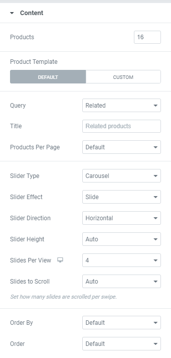
Products: Set desired amount of products to display.
Product Template: Choose between Default and Custom Product template.
When a Custom Product Template is selected you can choose the template to use.
Query: Choose the products to display between Related, Upsells and Cross-sells.
Widget where Cross-sells Query is selected can be used on a Cart page only.
Title: Add needed Widget Title here.
Products per Page: Choose the needed amouте from a dropdown.
Slider Type: Choose between Carousel and Coverflow.
Carousel is the standard rotating carousel skin that shows a customized number of image or video slides per view. This type allows you to choose a Slider Effect between Cube, Fade, Slide and Flip.
Coverflow is a slider skin that shows a central slide in the front and two side slides in the back.
Slider Direction: Choose between Horizontal and Vertical Slider direction.
Slider Height: Choose between Auto and Custom Slider Height.
Custom Slider Height allows to set desired slider height manually.
Slides Per View: Set the amount of Slides to be shown per row for desktop, tablet and mobile.
Slides to Scroll: Set the amount of Slides to be scrolled per swipe.
Order By: Choose desired order parameter from the dropdown. The choice is between Date, Title, Price, Popularity, Rating, Random or Menu Order.
Order: Set ascending or descending order.
Slider Options
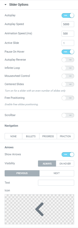
Autoplay: Slide to YES to enable Autoplay.
Autoplay Speed: Set desired speed here.
Animation Speed: Set the animation speed in milliseconds, i.e. how fast slides should slide.
Active Slide: Choose the slide that should be shown first.
Pause on Hover: Slide to YES to enable Pause on Hover.
Autoplay Reverse: Slide to YES to enable Autoplay reverse.
Infinite Loop: Slide to YES to enable Infinite Loop.
Mouse Wheel Control: Slide to YES to slide slides with a Mouse wheel.
Centered Slides: Slide to YES to center the Active slide.
Free Positioning: Slide to Yes to enable free slides positioning.
Scrollbar: Slide to YES to enable a scrollbar.
Navigation
Choose a slides’ Navigation from the dropdown. You can choose between None, Bullets, Progressbar and Fraction.
Arrows
Show Arrows: Slide to YES to enable arrows.
Visibility: Choose when arrows should be displayed. The choice is between “Always” and “On hover”.
Choose needed icons for Next and Previous arrows and add a Text if needed.
Widget Lazy Load
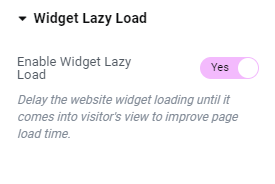
Enable Widget Lazy Load: Slide to YES to enable widget lazy load. Enabling the setting will delay the website widget loading until it comes into visitor’s view to improve page load time.
You can choose the settings you want in the widget’s Style tab, or set the Preloader view globally in the Site Settings to apply to all widgets with lazy loading enabled.
Style
Products
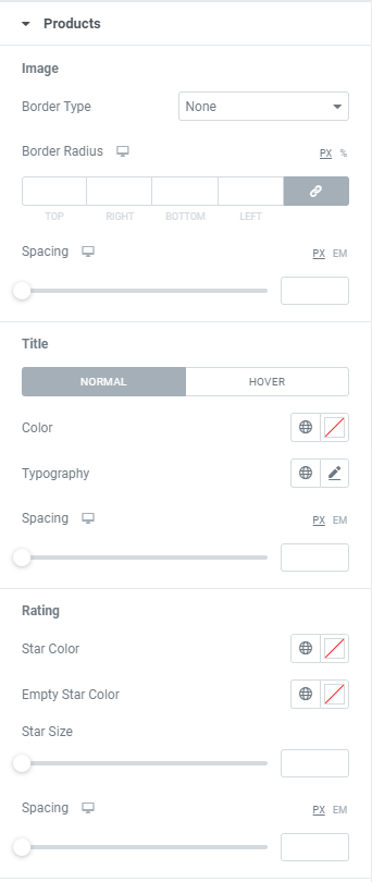
Image
Border Type: Choose a Border Type from the dropdown and set it.
Border Radius: Set a border radius to products.
Spacing: Set a spacing between Image and Title for desktop, tablet and mobile.
Title
Color: Choose a Title Color for Normal and Hover modes.
Typography: Set a Typography using settings from the dropdown.
Spacing: Set a spacing between Title and Rating for desktop, tablet and mobile.
Rating
Star Color: Choose a Star Color.
Empty Star Color: Choose an Empty Star Color.
Star Size: Set desired Star size.
Spacing: Set a spacing between Rating and Price for desktop, tablet and mobile.
Sale Price
Color: Choose a Sale Price Color.
Typography: Set a Typography using settings from the dropdown.
Regular Price
Color: Choose a Regular Price Color.
Typography: Set a Typography using settings from the dropdown.
Button
Show Button: Slide to YES to enable such buttons as ‘Add to Cart’, ‘Read more’, ‘Select Options’.
Typography: Set a Typography using settings from the dropdown.
Text Color: Choose a Button Text Color.
Background Color: Choose a Button Background Color.
Border Type: Choose a Border Type from the dropdown and set it.
Border Radius: Set a border radius to products.
Text Padding: Set desired paddings for Button Text.
Spacing: Set a spacing between Price and Button for desktop, tablet and mobile.
View Cart
Color: Choose a View Cart link Color.
Typography: Set a Typography using settings from the dropdown.
Product Box
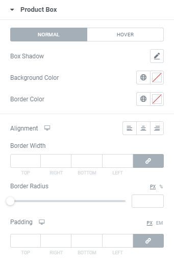
Box Shadow: Choose desired settings from the dropdown (for Normal and Hover Modes).
Background Color: Choose a Box Background Color (for Normal and Hover Modes).
Border Color: Choose a Box Border Color (for Normal and Hover Modes).
Alignment: Choose between Left, Center and Right Alignment for desktop, tablet and mobile.
Border Width: Set a border width to a box.
Border Radius: Set a border radius to a box.
Padding: Set Box paddings for desktop, tablet and mobile.
Sale Label
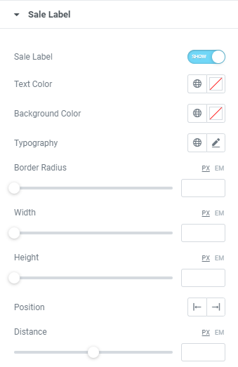
Sale Label: Slide to YES to enable the label.
Text Color: Choose a Label Text Color.
Background Color: Choose a Label Background Color.
Typography: Set a Typography using settings from the dropdown.
Border Radius: Set a border radius to a Label.
Width: Set a Label width.
Height: Set a Label height.
Position: Choose a Label position between Right and Left.
Distance: Set the distance of the Sale Label from the top of the products box.
Slider Layout
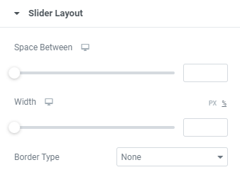
Space Between: Set a space between slides for desktop, tablet and mobile.
Width: Set slides’ width for desktop, tablet and mobile.
Border Type: Choose a Border Type from the dropdown and set it.
Slider Arrows
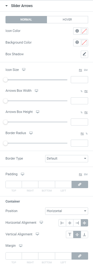
Icon Color: Choose Icon Color from a color palette or dynamic tags. (for Normal and Hover modes)
Background Color: Choose Icon Background Color from a color palette or dynamic tags. (for Normal and Hover modes)
Box Shadow: Choose desired settings from the dropdown. (for Normal and Hover modes)
Icon Size: Set Icon size for desktop, tablet and mobile.
Arrows Box Width: Set Arrows Box Width for desktop, tablet and mobile.
Arrows Box Height: Set Arrows Box Height for desktop, tablet and mobile.
Border Radius: Set Arrows Box border radius for desktop, tablet and mobile.
Border Type: Choose a Border Type from the dropdown and set it.
Padding: Set padding for desktop, tablet and mobile.
Container
Position: Choose between Horizontal and Vertical positions.
Horizontal alignment: Choose horizontal alignment between Start, Center, End and Space between for desktop, tablet and mobile.
Vertical alignment: Choose vertical alignment between Top, Center and Bottom for desktop, tablet and mobile.
Margin: Set margins for desktop, tablet and mobile.
Slider Navigation
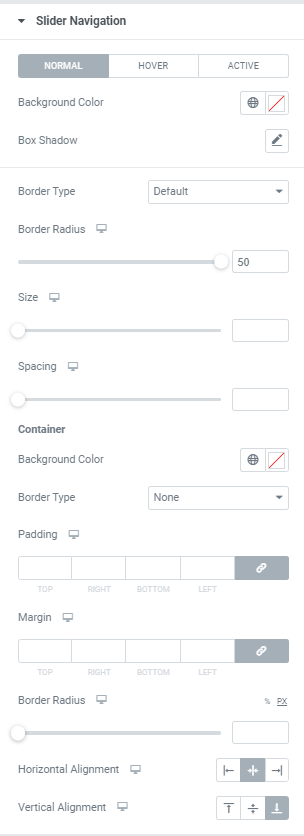
Background Color: Choose Navigation Background Color from a color palette or dynamic tags (for Normal, Hover and Active modes).
Box Shadow: Choose desired settings from the dropdown (for Normal, Hover and Active modes).
Border Type: Choose a Border Type from the dropdown and set it.
Border Radius: Set Navigation border radius for desktop, tablet and mobile.
Size: Set Navigation size for desktop, tablet and mobile.
Spacing: Set a spacing between bullets.
Container
Background Color: Choose a Container Background Color.
Border Type: Choose a Border Type from the dropdown and set it.
Padding: Set a Container padding for desktop, tablet and mobile.
Margin: Set a Container margins for desktop, tablet and mobile.
Border Radius: Set a Container border radius for desktop, tablet and mobile.
Horizontal alignment: Choose horizontal alignment between Left, Center and Right for desktop, tablet and mobile.
Vertical alignment: Choose vertical alignment between Top, Center and Bottom for desktop, tablet and mobile.
Widget Lazy Load Preloader Type Icon
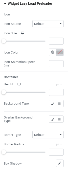
Icon
Icon Source: Choose default or custom icon.
Icon Size: Set the icon size for widescreen, desktop, tablet portrait and mobile portrait modes.
Icon Color: Choose the icon color.
Icon Animation Speed (ms): Set the icon animation speed in milliseconds.
Container
Height: Set the container height for widescreen, desktop, tablet portrait and mobile portrait modes.
Background Type: Choose the container background type between Classic and Gradient and set it.
Overlay Background Type: Choose the container overlay background type between Classic and Gradient and set it.
Border Type: Choose the border type from the dropdown.
Border Radius: Set a desired border radius.
Box Shadow: Choose desired settings from the dropdown.
Widget Lazy Load Preloader Type Grid
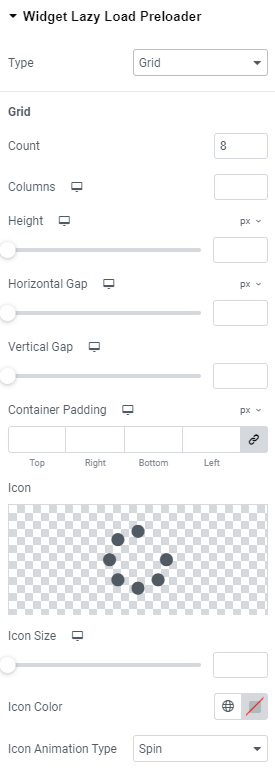
Grid
Count: Choose the number of icons that should be displayed.
Columns: Add the number of columns the icons should be shown for widescreen, desktop, tablet portrait and mobile portrait modes.
Height: Set the height for widescreen, desktop, tablet portrait and mobile portrait modes.
Horizontal gap: Choose Horizontal gap between elements for widescreen, desktop, tablet portrait and mobile portrait modes.
Vertical gap: Set Vertical gap between elements for widescreen, desktop, tablet portrait and mobile portrait modes.
Container padding: Add Container paddings for widescreen, desktop, tablet portrait and mobile portrait modes.
Icon: Choose the icon from Icon library or upload desired SVG.
Icon size: Set the icon size for widescreen, desktop, tablet portrait and mobile portrait modes.
Icon Color: Choose the icon color.
Icon Animation Type: Choose between none, Blink and Spin types.
Icon Animation Speed (ms): Set the icon animation speed in milliseconds.
Background Type: Choose the background type between Classic and Gradient and set it.
Border Type: Choose the border type from the dropdown.
Border Radius: Set a desired border radius.
Box Shadow: Choose desired settings from the dropdown.
Container
Background Type: Choose the container background type between Classic and Gradient and set it.
Overlay Background Type: Choose the container overlay background type between Classic and Gradient and set it.
Border Type: Choose the border type from the dropdown.
Border Radius: Set a desired border radius.
Box Shadow: Choose desired settings from the dropdown.
Advanced
Set the Advanced options that are applicable to this widget