Video Slider Widget

Use the Video Slider Widget to easily embed video sliders on your page.

Content

Add needed amount of items using +ADD ITEM button or copying items that are already added

On a Slide settings choose the Source from the dropdown (choose between YouTube, Vimeo, Dailymotion or Self Hosted (which includes hosting on external servers)), insert the Link to the video, add Cover Image and Title, Subtitle and Author if needed. (When Author is added you can add a Link for Author).

Video

Aspect Ratio: Change the video’s aspect ratio. Choice includes: 1:1, 3:2, 4:3, 16:9, 21:9, and 9:16

Effect: Choose desired Slide effect from the dropdown.

Additional options

Navigation

Enable navigation: Slide to ON to enable navigation.

Position: Choose between Video and Info Box positions for navigation arrows.

Position Video displays navigation arrows on a video itself.

Position Info Box displays navigation arrows on an Info Box under the video that can be seen only when Title or/and Author are added on a slide’s settings.

Sliding time: Set the amount of time for slides changing, i.e. how fast a sliding effect should function.

Auto Slide: Slide to YES to enable auto sliding.

Auto Slide Timeout: Set the amount of time in milliseconds after which the slide should be automatically changed by another one.

Auto Slide Reverse: Slide to YES to enable auto sliding in the opposite direction.

Pause on Hover: Slide to YES to enable Pause on hovering on the slider.

Loop: Slide to YES to Loop sliding.

Active Slide: Choose the slide that should be shown first.

Style

Info box

Position: Choose between Under and Inside Info box position.

Text Align: Choose between Left, Center or Right text align.

Background: Set Background color via color palette.

Padding: Set paddings for desktop, tablet and mobile.

Info

Variations: Choose from the dropdown the sequence of Title, Subtitle and Author displaying.

Bottom Gap: Set a Bottom gap for desktop, tablet and mobile. (for Title, Subtitle and Author)

Color: Choose desired colors for Title, Subtitle and Author.

For Author you can also choose a Hover Color.

Typography: Set a Typography using settings from the dropdown.(for Title, Subtitle and Author)

Cover and Buttons

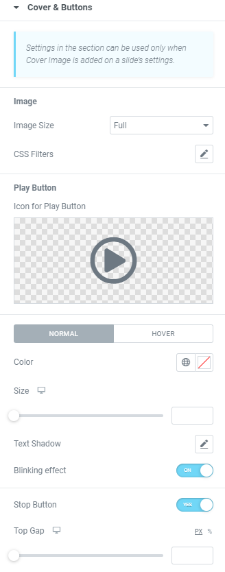
Please note that settings in the section can be used only when Cover Image is added on a slide’s settings.

Image

Image Size: Choose desired image size from the dropdown.

CSS Filters: Use CSS filters to set Blur, Brightness, Contrast, Saturation and Hue.

Play Button

Icon for Play Button: Choose the icon from Icon library or upload desired SVG.

Color: Choose the Icon color both for Normal and Hover modes.

Size: Set the Icon size for desktop, tablet and mobile.

Text Shadow: Set a Text Shadow via settings from the dropdown.

Blinking Effect: Slide to ON to enable blinking effect.

Stop Button: Slide to YES to enable a stop button.

Top Gap: Set a Stop button top gap for desktop, tablet and mobile.

Arrows navigation

Button Type: Choose between Icon, Text or Both types.

Button Gap: Set a Button gap for desktop, tablet and mobile.

Button Style: Choose between Link and Button styles.

Icon Size: Set desired Icon size here.

Icon: Choose the icon from Icon library or upload desired SVG. (for Previous and Next icons)

Colors

Icon Color: Choose the Icon color both for Normal and Hover modes.

Text Shadow: Set a Text Shadow via settings from the dropdown.(for Normal and Hover modes)

Navigation Opacity: Set desired opacity (for Normal and Hover modes)

For Hover mode you can also set Transition duration, i.e. the amount of time to transition from one filter setting to the other when hovering.

Advanced

Set the Advanced options that are applicable to this widget