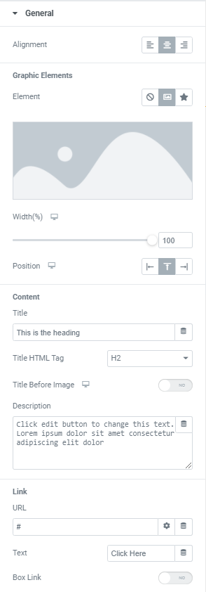
Featured Box Widget

Content

General

Alignment: Choose the Alignment of the content between Left, Center and Right.

Graphic Element: Choose the Element between Image, Icon and None.

In case Image element is chosen you can add desired image, choose its Size from the dropdown and set its Width and Position for desktop, tablet and mobile. You can choose between Left, Top and Right Image Position.

When Left or Right Image Position is selected you can also set Image Vertical Position (Top, Middle or Bottom).

Icon element allows to choose the Icon from Icon library or upload desired SVG and set the Icon Size and Position for desktop, tablet and mobile. You can choose between Left, Top and Right Icon Position.

When Left or Right Icon Position is selected you can also set Icon Vertical Position (Top, Middle or Bottom).

Content

Title: Add desired Title here.

Choose Title HTML Tag from the dropdown.

Slide to YES to place the Title Before Image on desktop, tablet and mobile.

Description: Add a description here.

Link

URL: Add a link here.

Text: Add a Button label here.

Box Link: Slide to YES to allow the whole Featured Box to link to the added URL.

Style

Graphic Element

Graphic Element can be set for both Normal and Hover modes.

Background color: Choose the Background Color from a color palette or dynamic tags.

Border Color: Choose the Border Color from a color palette or dynamic tags.

Box Shadow: Choose desired settings from the dropdown.

CSS Filters: Use filters to set Blur, Brightness, Contrast, Saturation and Hue.

Opacity: Set the Opacity of a Graphic Element.

For Hover mode you can also set Transition Duration – the amount of time to transition from one filter setting to the other when hovering.

Spacing: Set the Spacing between a Graphic Element and a content for desktop, tablet and mobile.

Border Type: Choose the Border Type from the dropdown and set it.

Border Radius: Set the Border Radius for your Graphic Element for desktop, tablet and mobile.

Padding: Set the Padding for desktop, tablet and mobile.

Content Area

Background Type: Choose Background Type between Classic and Gradient and set it in a desired way.

Border Type: Choose the Border Type from the dropdown and set it.

Border Radius: Set the Border Radius for a Content Wrapper for desktop, tablet and mobile.

Padding: Set the Padding for desktop, tablet and mobile.

Title

Set a Typography using settings from the dropdown.

Color: Choose the Title Color from a color palette or dynamic tags.

Text Shadow: Choose desired settings from the dropdown.

Spacing: Set a Spacing between Title and Description.

Description

Set a Typography using settings from the dropdown.

Color: Choose the Description Color from a color palette or dynamic tags.

Text Shadow: Choose desired settings from the dropdown.

Spacing: Set a Spacing between Description and a Button.

Button

Set a Typography using settings from the dropdown.

Choose a Text Color, Background Color and Border Color from a color palette or dynamic tags and desired Box Shadow settings from the dropdown both for Normal and Hover modes.

Border Type: Choose the Button Border Type from the dropdown and set it.

Border Radius: Set a Button Border Radius for desktop, tablet and mobile.

Padding: Set the Padding between Text and Borders for desktop, tablet and mobile.

Overlay

Background color: Choose the Background Color from a color palette or dynamic tags.

Hide on Hover: Slide to YES to hide a color overlay on hover.

Advanced

Set the Advanced options that are applicable to this widget