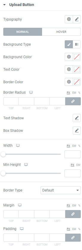
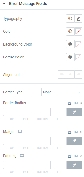
Typography: Set a Typography using settings from the dropdown.
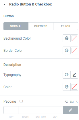
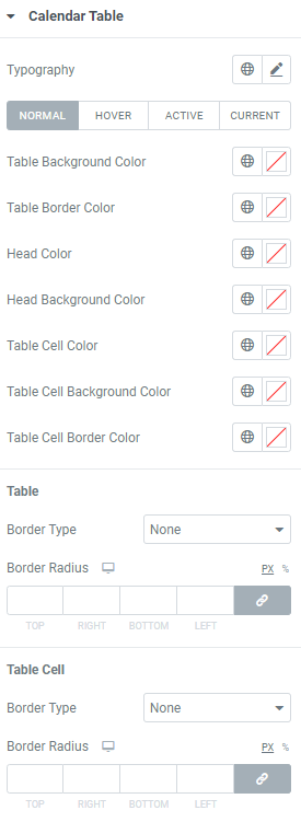
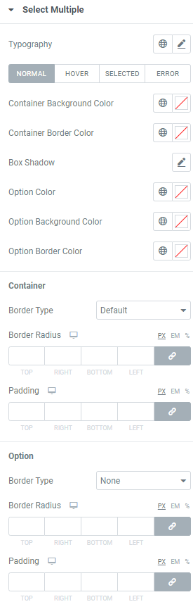
Set colors for Normal, Hover, Focus and Error modes.
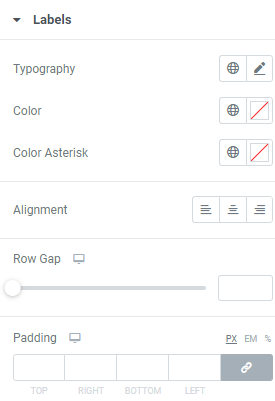
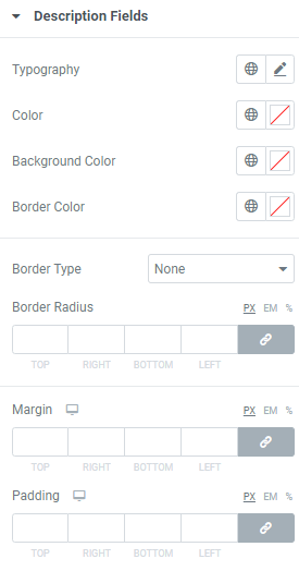
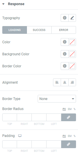
Color: Choose a Color from a color palette or dynamic tags.
Background Color: Choose a Background color from a color palette or dynamic tags.
Border Color: Choose a Border color from a color palette or dynamic tags.
Icon Color: Choose an Icon Color from a color palette or dynamic tags.
Prefix/Suffix Color: Choose Prefix/Suffix Color from a color palette or dynamic tags.
Border Radius: Set Border Radius to fields (for desktop, tablet and mobile).
Box Shadow: Choose desired settings from the dropdown.
Fields Text Alignment: Choose between Left, Center and Right alignment for a text added to a contact form fields.
Row Gap: Set a gap between the form fields (for desktop, tablet and mobile).
Icon Gap: Set a gap between Icon and content (for desktop, tablet and mobile).
Prefix/Suffix Gap: Set a gap between Prefix/Suffix and content (for desktop, tablet and mobile).
Textarea Height: Set needed Textarea Height for desktop, tablet and mobile.
Border Type: Choose a Border Type from the dropdown and set it.
Padding: Set padding for desktop, tablet and mobile.