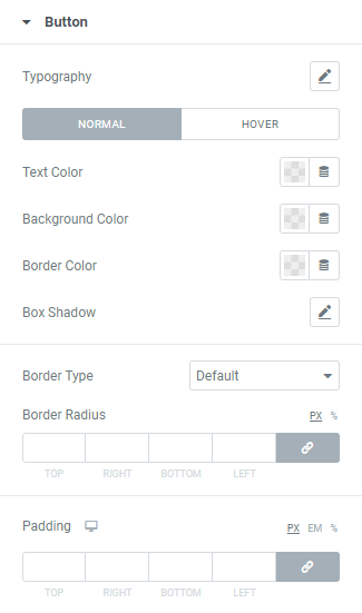
Typography: Set a Typography using settings from the dropdown.
Text Color: Choose Button’s Text color from a color palette or dynamic tags.(for Normal and Focus modes)
Placeholder Color: Choose a Placeholder color from a color palette or dynamic tags.(for Normal and Focus modes)
Background Color: Choose a Background color from a color palette or dynamic tags.(for Normal and Focus modes)
Border Color: Choose a Border color from a color palette or dynamic tags.(for Normal and Focus modes)
Box Shadow: Choose desired settings from the dropdown.(for Normal and Focus modes)
Border Type: Choose a Border Type from the dropdown and set it.
Border Radius: Set needed Border Radius.
Padding: Set paddings for desktop, tablet and mobile.