Mailchimp Widget

Use the Mailchimp widget to add Mailchimp to a page.

To use the widget proceed to the Addon Settings/Integrations tab and add your Mailchimp API key to a corresponding field.

A critical first step to getting started with Mailchimp is setting up your audience. Whether you’re starting from scratch, or bringing existing contacts into Mailchimp, your audience is where you’ll store and manage all your contact data.

We recommend to look through the article where you can learn how to create and organize your audience https://mailchimp.com/help/create-audience/

Content

Mailchimp Settings

Form Action field allows users to choose Subscribe or Unsubscribe form and set them.

Subscribe form provides the following settings:

Mailchimp List: Choose a Mailchimp list/audience to use.

Name: Choose if the Name field is Optional, Required or is disabled at all.

Use a Last Name: Slide to YES to enable a Last Name.

Address: Choose if the Address fields are Optional, Required or are disabled at all.

When Optional Address is selected address fields must be either ALL empty or ALL filled.

Phone: Choose if the Phone field is Optional, Required or is disabled at all.

Birthday Date: Choose if the Birthday Date field is Optional, Required or is disabled at all.

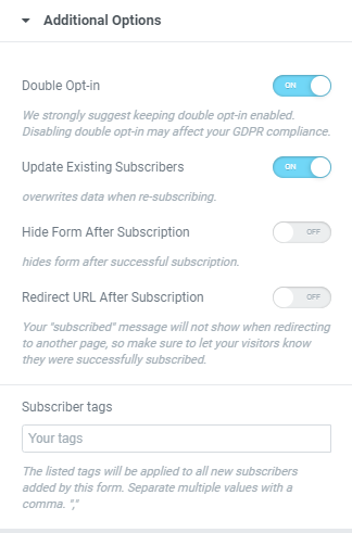
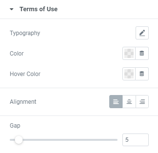
Terms of Use: Slider to SHOW to enable a link to a Terms of Use page.

When enabled you can add a Link to a page where terms of use are listed and choose a Terms of Use Position between Left, Top and Right.

Labels/Placeholders Visibility: Choose Labels, Placeholders or Both to be displayed.

Unsubscribe form provides the following settings:

Mailchimp List: Choose a Mailchimp list/audience to use.

Confirmation Message: Slider to SHOW to enable a confirmation message.

When enabled you can choose a Confirmation Message Position between Left, Top and Right.

Labels/Placeholders Visibility: Choose Labels, Placeholders or Both to be displayed.

Additional Options

Double Opt-in: Slide to ON to enable double opt-in. You can find more information about the method here: https://mailchimp.com/help/single-opt-in-vs-double-opt-in/

Update Existing Subscribers: Slide to ON to enable Existing Subscribers update.

When enabling the “update existing subscribers” setting it means that people may already be subscribed to the selected Mailchimp list(s) and in case someone is already subscribed to a list, their profile in Mailchimp will be updated with the new data the widget sends to Mailchimp.

Hide Form After Subscription: Slide to ON to hide a form after subscription.

Redirect URL After Subscription: Slide to ON to add an URL where a user will be redirected after subscription.

Your “subscribed” message will not show when redirecting to another page, so make sure to let your visitors know they were successfully subscribed.

Subscriber tags: Add needed tags here. The listed tags will be applied to all new subscribers added by this form.

Elements Text

Add needed labels to the form fields.

Messages

Add needed text that will be shown in this or that situation when a user makes a subscription.

Style

Layout

Set Rows and Columns gap and a form fields’ width for desktop, tablet and mobile.

Fields

Typography: Set a Typography using settings from the dropdown.

Text Color: Choose a Text Color from a color palette or dynamic tags.(for Normal and Focus modes)

Background Color: Choose a Background Color from a color palette or dynamic tags.(for Normal and Focus modes)

Border Color: Choose a Border Color from a color palette or dynamic tags.(for Normal and Focus modes)

Box Shadow: Choose desired settings from the dropdown.

Border Type: Choose the Border Type from the dropdown and set it.

Border Radius: Set a border radius to the Image.

Padding: Set the Padding for desktop, tablet and mobile.

Labels

Typography: Set a Typography using settings from the dropdown.

Color: Choose a Color from a color palette or dynamic tags.

Spacing: Set a spacing between labels.

Terms of Use

Typography: Set a Typography using settings from the dropdown.

Color: Choose a Color from a color palette or dynamic tags.

Hover Color: Choose a Hover Color from a color palette or dynamic tags.

Alignment: Choose alignment between Left, Center or Right.

Gap: Set a gap between checkbox and text.

Button

Typography: Set a Typography using settings from the dropdown.

Text Color: Choose a Text Color from a color palette or dynamic tags.(for Normal, Hover and Disabled modes)

Background Color: Choose a Background Color from a color palette or dynamic tags.(for Normal, Hover and Disabled modes)

Border Color: Choose a Border Color from a color palette or dynamic tags.(for Normal, Hover and Disabled modes)

Box Shadow: Choose desired settings from the dropdown.

Alignment: Choose alignment between Left, Center, Right or Justified.

Border Type: Choose the Border Type from the dropdown and set it.

Border Radius: Set a border radius to the Image.

Padding: Set the Padding for desktop, tablet and mobile.

Loader

Icon: Choose the Icon from Icon library or upload desired SVG.

Loader Size: Set a Loader size here.

Loader Color: Choose a Loader Color from a color palette or dynamic tags.

Message

Typography: Set a Typography using settings from the dropdown.

Success

Color: Choose a Color from a color palette or dynamic tags.

Background Color: Choose a Background Color from a color palette or dynamic tags.

Border Color: Choose a Border Color from a color palette or dynamic tags.

Error

Color: Choose a Color from a color palette or dynamic tags.

Background Color: Choose a Background Color from a color palette or dynamic tags.

Border Color: Choose a Border Color from a color palette or dynamic tags.

Alignment: Choose alignment between Left, Center, Right or Justified.

Border Type: Choose the Border Type from the dropdown and set it.

Padding: Set the Padding for desktop, tablet and mobile.

Margin: Set the Margin for desktop, tablet and mobile.

Advanced

Set the Advanced options that are applicable to this widget