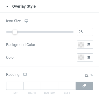
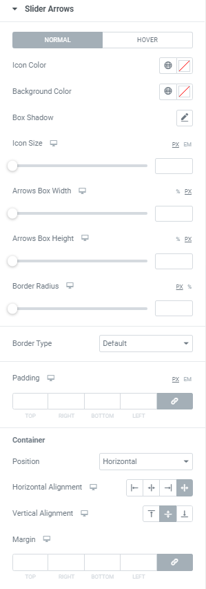
Icon Color: Choose Icon Color from a color palette or dynamic tags. (for Normal and Hover modes)
Background Color: Choose Icon Background Color from a color palette or dynamic tags. (for Normal and Hover modes)
Box Shadow: Choose desired settings from the dropdown. (for Normal and Hover modes)
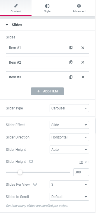
Icon Size: Set Icon size for desktop, tablet and mobile.
Arrows Box Width: Set Arrows Box Width for desktop, tablet and mobile.
Arrows Box Height: Set Arrows Box Height for desktop, tablet and mobile.
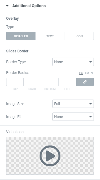
Border Radius: Set Arrows Box border radius for desktop, tablet and mobile.
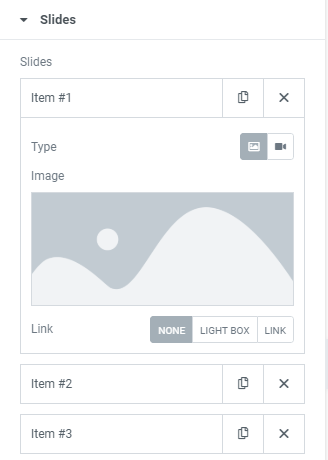
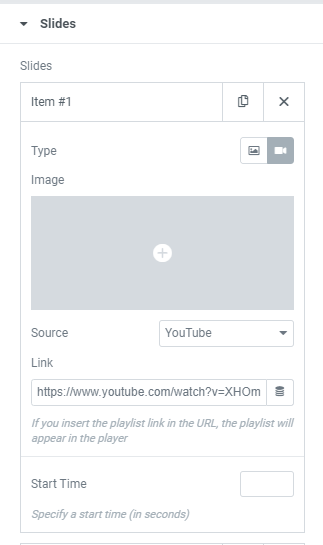
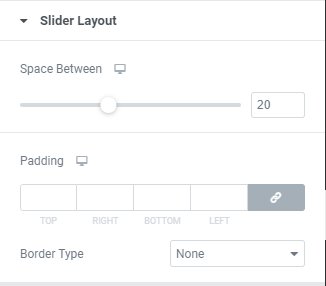
Border Type: Choose a Border Type from the dropdown and set it.
Padding: Set padding for desktop, tablet and mobile.
Container
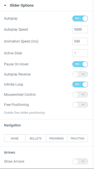
Position: Choose between Horizontal and Vertical positions.
Horizontal alignment: Choose horizontal alignment between Start, Center, End and Space between for desktop, tablet and mobile.
Vertical alignment: Choose vertical alignment between Top, Center and Bottom for desktop, tablet and mobile.
Margin: Set margins for desktop, tablet and mobile.