Navigation Menu Widget
Use the Navigation Menu Widget to easily customize the Navigation menu on your site.
To enable and set up Mega Menu on your website please see the article here.
Content
Menu General
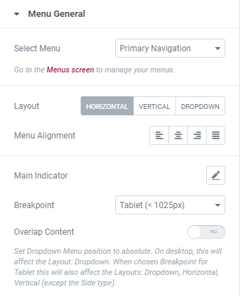
Select the Menu from the dropdown and and choose the Layout between Horizontal, Vertical and Dropdown.
Horizontal menu layout
Alignment: Choose between Left, Center, Right and Justified Menu alignment.
Main indicator: Choose the Icon that will be used as a Main indicator from Icon library or upload desired SVG and set it.
Choose a Main Indicator Animation from the dropdown.
Transition Duration: Set the amount of time to transition from one filter setting to the other when hovering.
Breakpoint: Choose the screen dimension from the dropdown when your Menu should transform into its Mobile version.
Overlap Content: Slide to YES to set Dropdown Menu position to absolute.
On desktop, this will affect the Layout: Dropdown. When chosen Breakpoint for Tablet this will also affect the Layouts: Dropdown, Horizontal, Vertical (except the Side type).
Vertical menu layout
Type: Choose the Menu type between Normal, Toggle, Accordion and Side.
Normal Menu type allows to:
- choose Menu Alignment between Left, Center, Right and Justified;
- choose the icon that will be used as a Main indicator from Icon library or upload desired SVG and set it;
- choose the screen dimension from the dropdown when your Menu should transform into its Mobile version (Breakpoint);
- enable Overlap Content to set Dropdown Menu position to absolute;
- choose the Dropdown Placement between Left and Right sides.
Toggle and Accordion Menu types allow to:
- choose the screen dimension from the dropdown when your Menu should transform into its Mobile version (Breakpoint);
- enable Overlap Content to set Dropdown Menu position to absolute;
- choose whether you want to open the menu item link by a click.
Side Menu type allows to:
- choose between Left, Center, Right and Justified Menu alignment;
- choose between Left and Right Menu Position;
- choose the screen dimension from the dropdown when your Menu should transform into its Mobile version (Breakpoint).
Please note that when the Side Menu type is chosen only main menu items are displayed and menu subitems are hidden.
Dropdown menu layout allows to choose between Default, Popup and Offcanvas types.
Default type allows to enable Overlap Content to set Dropdown Menu position to absolute.
Dropdown Toggle
This toggle will appear on resolutions below the one defined in Breakpoint settings.
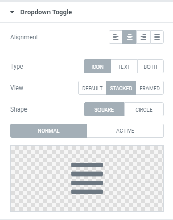
Alignment: Choose between Left, Center, Right and Justified alignment.
Type: Choose between Icon, Text and Both (Icon+Text) toggle type.
Icon Type allows to:
- choose between Default, Stacked and Framed Views;
Stacked and Framed allow to choose between Square and Circle Shapes - choose Icon (for Normal and Active modes) that should be used for the Menu.
Text Type allows to:
- choose between Default, Stacked and Framed Views;
- add desired Menu text.
Icon and Text Type combines Icon Type and Text Type settings and also allows to set a Gap between Icon and Text.
Dropdown Menu
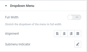
Full Width: Slide o YES to stretch the dropdown of the menu to full width.
Alignment: Choose between Left,Center,Right and Justified dropdown menu items alignment.
Submenu indicator: Choose the Icon that will be used as a Submenu indicator from Icon library or upload desired SVG and set it.
Popup/Offcanvas Settings
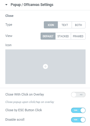
Close
Type: Choose a “Close” type between Icon, Text and Both (Icon+Text).
Icon Type allows to:
- choose between Default, Stacked and Framed Views;
Stacked and Framed allow to choose between Square and Circle Shapes. - choose a ‘Close’ Icon from Icon library or upload desired SVG.
Text Type allows to:
- choose between Default, Stacked and Framed Views;
- add desired ‘Close’ text.
Icon and Text Type combines Icon Type and Text Type settings and also allows to set a Gap between Icon and Text.
Close with Click on Overlay: Slide to YES to close a popup upon click/tap on overlay.
Close by ESC Button Click: Slide to YES to close the Popup via Esc button click.
Disable Scroll: Slide to YES to disable a page scroll when Popup is opened.
Style
Main Menu
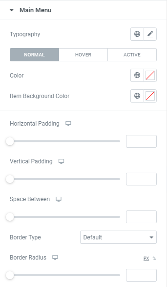
Typography: Set Typography using settings from the dropdown.
Color: Set a menu items’ color for Normal, Hover and Active modes.
Item Background Color: Set a menu items’ background color for Normal, Hover and Active modes.
Horizontal Padding: Set Horizontal padding for desktop, tablet and mobile.
Vertical Padding: Set Vertical padding for desktop, tablet and mobile.
Space Between: Set a space between menu items for desktop, tablet and mobile.
Border Type: Choose Menu items Border Type from the dropdown and set it.
Border Radius: Set Border Radius for Menu Icon for desktop, tablet and mobile.
Dropdown Toggle
This toggle will appear on resolutions below the one defined in Breakpoint settings.
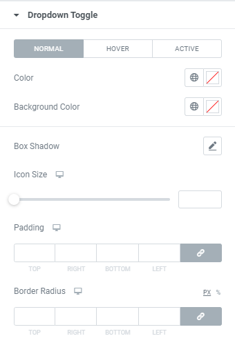
Color: Choose a Toggle Background color via color palette or dynamic tags. (for Normal, Hover and Active modes)
Background Color: Choose a Toggle Background color via color palette or dynamic tags. (for Normal, Hover and Active modes)
Box Shadow: Choose desired settings from the dropdown.
Icon Size: Set the Icon size for desktop, tablet and mobile.
Padding: Set paddings for desktop, tablet and mobile.
Border Radius: Set Border Radius for a dropdown toggle.
Dropdown List
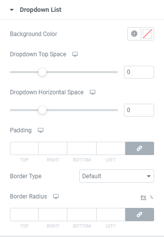
Background Color: Choose a dropdown list background color via color palette or dynamic tags
Dropdown Top Space: Set dropdown top space for desktop, tablet and mobile.
Dropdown Horizontal Space (for second and more dropdown levels): Set dropdown horizontal space for desktop, tablet and mobile.
Padding: Set padding for desktop, tablet and mobile.
Border Type: Choose a dropdown list border type from the dropdown and set it.
Border Radius: Set Border Radius for a dropdown toggle.
Dropdown Item
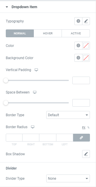
Typography: Set Typography using settings from the dropdown.
Color: Choose a dropdown item color via color palette or dynamic tags. (for Normal, Hover and Active modes)
Background Color: Choose a dropdown item background color via color palette or dynamic tags. (for Normal, Hover and Active modes)
Vertical Padding: Set dropdown menu items vertical padding for desktop, tablet and mobile.
Space Between: Set a space between dropdown menu items for desktop, tablet and mobile.
Border Type: Choose a dropdown item border type from the dropdown and set it.
Border Radius: Set Border Radius for a dropdown item.
Box Shadow: Choose desired settings from the dropdown.
Divider
Divider Type: Choose a divider type from the dropdown and set its size and color.
Popup/Offcanvas
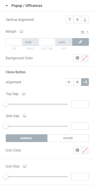
Vertical Alignment: Choose between Top, Middle and Bottom vertical alignment.
Margin: Set margin for desktop, tablet and mobile.
Background Color: Choose a dropdown item background color via color palette or dynamic tags.
Close Button
Alignment: Choose between Left, Center and Right alignment.
Top Gap: Set a Close button top gap for desktop, tablet and mobile.
Side Gap: Set a Close button side gap for desktop, tablet and mobile.
Icon Color: Choose an Icon color via color palette or dynamic tags. (for Normal and Hover modes)
Background Color: Choose an Icon background color via color palette or dynamic tags. (for Normal and Hover modes)
Box Shadow: Choose desired settings from the dropdown.
Icon Size: Set the Icon size for desktop, tablet and mobile.
Padding: Set padding for desktop, tablet and mobile.
Border Radius: Set Border Radius for a dropdown item.
Advanced
Set the Advanced options that are applicable to this widget