Posts Grid Widget
Content
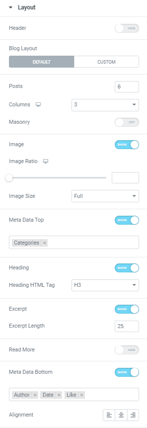
Header: Slide to Show to enable a Header.
When Header is enabled you can activate/deactivate a Header filter.
Blog layout: Choose between Default and Custom Blog layout.
Default layout provides the following settings:
Posts: Set amount of posts that should be shown.
Columns: Choose the amount of columns for desktop, tablet and mobile.
Masonry: Slide to ON to activate masonry mode.
Image: Slide to SHOW to enable post image.
When Image is enabled you can set Image Ratio for desktop, tablet and mobile and choose desired Image size from the dropdown.
Meta Data Top: Slide to SHOW to enable Meta Data Top and choose metadata to be displayed.
Heading: Slide to SHOW to enable post heading.
When Heading is enabled you can choose the needed Heading HTML tag from the dropdown.
Excerpt: Slide to SHOW to enable post excerpt.
When Excerpt is enabled you can set its Length.
Read More: Slide to SHOW to enable “Read More”.
When “Read More” is enabled you can add needed text and icon.
Meta Data Bottom: Slide to SHOW to enable Meta Data Bottom and choose metadata to be displayed.
Alignment: Choose between Left, Center and Right post content alignment.
Pagination: Slide to SHOW to enable pagination.
Custom layout allows you to choose the desired Entry template to be displayed.
Entry template should be created on the Entry tab, you can find more information on it here.
Posts: Set amount of posts that should be shown.
Columns: Choose the amount of columns for desktop, tablet and mobile.
Masonry: Slide to ON to activate masonry mode.
Pagination: Slide to SHOW to enable pagination.
Query
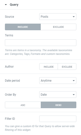
Source: Choose a source between All Posts, Manual Selection, Current Query (can be used for archive pages), Custom Arguments and Related posts.
You can Include or Exclude posts.
Include option settings
Terms: Add needed terms (taxonomies) to show corresponding posts.
Author: Include or Exclude posts’ authors, i.e. choose posts by what authors you want (or don’t want) to be displayed.
If no author is added all posts will be shown.
Date period: Choose from the dropdown posts of what date period should be displayed.
When the Past Day(s), Past Week(s) or Past Month(s) period is chosen you can set the amount of the past days/weeks/months.
Order By: Choose the order parameter from the dropdown and set Ascending or Descending order.
Filter ID: You can give a custom ID for that Query to allow server-side filtering of this widget.
Exclude option settings
Terms: Add needed terms (taxonomies) to exclude corresponding posts.
Manual Selection: Search & Select posts to exclude from query.
Ignore Sticky Posts: Slide to YES to exclude sticky posts.
Exclude Current post: Slide to YES to exclude current post from this query.
Offset: Use this parameter to skip the first few query posts (e.g. set ‘3’ to skip the first three posts of the query).
Prevent Duplicates: Slide to YES to prevent showing duplicate posts in one page.
The setting affects only the frontend.
Author: Include or Exclude posts’ authors, i.e. choose posts by what authors you want (or don’t want) to be displayed.
Date period: Choose from the dropdown posts of what date period should be displayed.
When the Past Day(s), Past Week(s) or Past Month(s) period is chosen you can set the amount of the past days/weeks/months.
Order By: Choose the order parameter from the dropdown and set Ascending or Descending order.
Filter ID: You can give a custom ID for that Query to allow server-side filtering of this widget.
Pagination
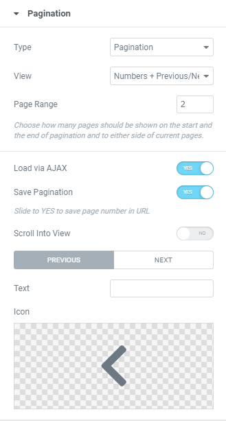
Type: Choose a pagination type from the dropdown. (Pagination, Infinite scroll or ‘Load more’ button)
Pagination Type
View: Choose between Numbers+Previous/Next buttons, only Numbers or only Previous/Next buttons.
Page Range: Choose how many pages should be shown on the start and the end of pagination and to either side of current pages.
Load via AJAX: Slide to YES to load posts without page reloading.
Save Pagination: Slide to YES to save page number in URL.
Scroll into View: Slide to YES to scroll products into the visible area of the browser window.
Choose Previous and Next Icons and add a Text to them if needed.
Infinite scroll Type
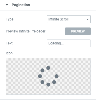
Preview Infinite Preloader: Click to see how a preloader functions.
Text: Add a needed Infinite text.
Icon: Choose the icon from Icon library or upload desired SVG.
‘Load more’ Type
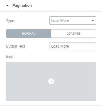
Button Text: Add Button Text for Normal and Loading modes.
Icon: Choose the icon from Icon library or upload desired SVG.
Widget Lazy Load
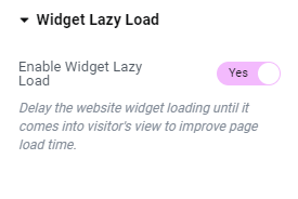
Enable Widget Lazy Load: Slide to YES to enable widget lazy load. Enabling the setting will delay the website widget loading until it comes into visitor’s view to improve page load time.
You can choose the settings you want in the widget’s Style tab, or set the Preloader view globally in the Site Settings to apply to all widgets with lazy loading enabled.
Style
Layout
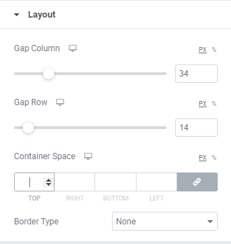
Columns Gap: Set Columns Gap for desktop, tablet and mobile.
Rows Gap: Set Rows Gap for desktop, tablet and mobile.
Border Type: Choose a Border Type from the dropdown and set it.
Pagination
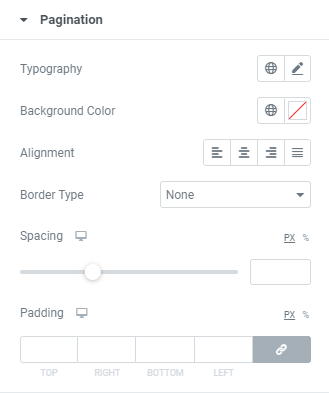
Typography: Set a Typography using settings from the dropdown.
Background Color: Choose Background color from a color palette or dynamic tags.
Alignment: Choose between Left, Center, Right or Justified alignment.
Border Type: Choose a Border Type from the dropdown and set it.
Spacing: Set a spacing between pagination and content.
Padding: Set a padding for desktop, tablet and mobile.
Pagination: Arrows
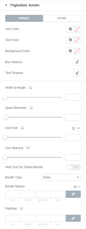
Icon Color: Choose an Icon Color from a color palette or dynamic tags. (for Normal and Hover modes)
Text Color: Choose a Text Color from a color palette or dynamic tags. (for Normal and Hover modes)
Background Color: Choose a Background Color from a color palette or dynamic tags. (for Normal and Hover modes)
Border Color: Choose a Border Color from a color palette or dynamic tags. (for Normal and Hover modes)
Box Shadow: Choose desired settings from the dropdown.(for Normal and Hover modes)
Text Shadow: Choose desired settings from the dropdown.
Width and Height: Set arrows’ box width and height for desktop, tablet and mobile.
Space Between: Set a space between arrows and numbers for desktop, tablet and mobile.
Icon Size: Set arrows’ icon size for desktop, tablet and mobile.
Icon Spacing: Set a spacing between icon and text.
Hide Text on Tablet/Mobile: Slide to YES to hide text on tablet/mobile.
Border Type: Choose a Border Type from the dropdown and set it.
Border Radius: Set a border radius to numbers.
Padding: Set padding for desktop, tablet and mobile.
Pagination: Numbers
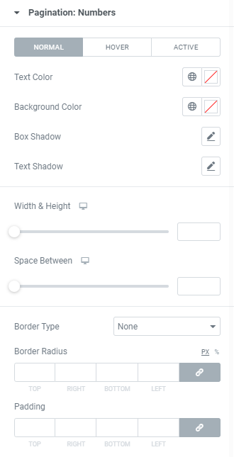
Text Color: Choose a Text Color from a color palette or dynamic tags. (for Normal, Hover and Active modes)
Background Color: Choose a Background Color from a color palette or dynamic tags. (for Normal, Hover and Active modes)
Box Shadow: Choose desired settings from the dropdown.(for Normal, Hover and Active modes)
Text Shadow: Choose desired settings from the dropdown.
Width and Height: Set numbers’ width and height for desktop, tablet and mobile.
Space Between: Set a space between numbers for desktop, tablet and mobile.
Border Type: Choose a Border Type from the dropdown and set it.
Border Radius: Set a border radius to numbers.
Padding: Set padding for desktop, tablet and mobile.
Post
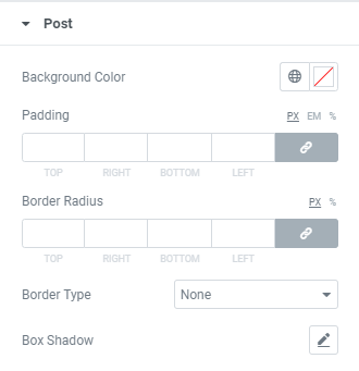
Background Color: Choose a Background Color from a color palette or dynamic tags.
Padding: Set padding for desktop, tablet and mobile.
Border Radius: Set a border radius to posts.
Border Type: Choose a Border Type from the dropdown and set it.
Box Shadow: Choose desired settings from the dropdown.
Post: Image
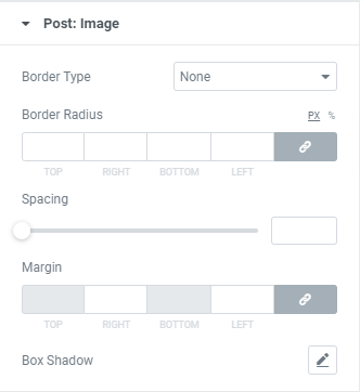
Border Type: Choose a Border Type from the dropdown and set it.
Border Radius: Set a border radius to posts’ images.
Spacing: Set a spacing between Image and other content.
Margin: Set desired image margins.
Box Shadow: Choose desired settings from the dropdown.
Post: Meta Data Top
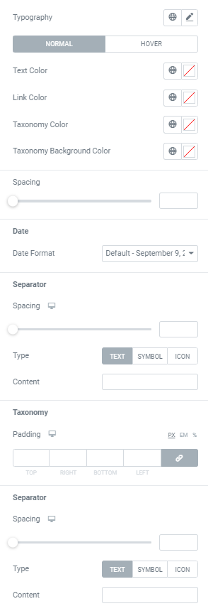
Typography: Set a Typography using settings from the dropdown.
Text Color: Choose a Text Color from a color palette or dynamic tags. (for Normal and Hover modes)
Link Color: Choose a Link Color from a color palette or dynamic tags.(for Normal and Hover modes)
Taxonomy Color: Choose a Taxonomy Color from a color palette or dynamic tags.(for Normal and Hover modes)
Taxonomy Background Color: Choose a Taxonomy Background Color from a color palette or dynamic tags.(for Normal and Hover modes)
Spacing: Set a spacing between Meta Data Top and other content.
Date: Choose Date format from the dropdown.
Separator
Spacing: Set desired space between separator and meta data for desktop, tablet and mobile.
Type: Choose desired Separator type between Text, Symbol and Icon and set it.
Taxonomy
Padding: Set padding for desktop, tablet and mobile.
Separator
Spacing: Set desired space between separator and meta data for desktop, tablet and mobile.
Type: Choose desired Separator type between Text, Symbol and Icon and set it.
Post: Heading
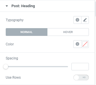
Typography: Set a Typography using settings from the dropdown.
Color: Choose Heading Color from a color palette or dynamic tags. (for Normal and Hover modes)
Spacing: Set a spacing between Heading and other content.
Use Rows: Slide to YES to use rows and add the desired amount of rows to be used on a Title field.
Post:Excerpt
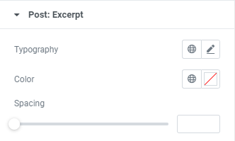
Typography: Set a Typography using settings from the dropdown.
Color: Choose a Color from a color palette or dynamic tags.
Spacing: Set a spacing between Excerpt and other content.
Post: Meta Data Bottom
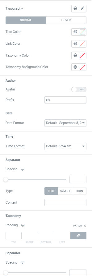
Typography: Set a Typography using settings from the dropdown.
Choose Colors’ settings for Normal and Hover modes.
Text Color: Choose a Text Color from a color palette or dynamic tags. The setting applies to Date, Time, View and Formats.
Link Color: Choose a Link Color from a color palette or dynamic tags. The setting applies to Author, Likes and Comments.
Taxonomy Color: Choose Taxonomy Color from a color palette or dynamic tags. The setting applies to Categories and Tags.
Taxonomy Background Color: Choose a Background color from a color palette or dynamic tags.
Author
Slide to SHOW to enable Avatar and set its Size. Add Prefix if needed (for example: ‘by’).
Date: Choose Date format from the dropdown.
Time: Choose Time format from the dropdown.
Separator
Space Between: Set desired space between separator and meta data for desktop, tablet and mobile.
Type: Choose desired Separator type between Text, Symbol and Icon and set it.
Taxonomy
Padding: Set padding for desktop, tablet and mobile.
Separator
Spacing: Set desired space between separator and meta data for desktop, tablet and mobile.
Type: Choose desired Separator type between Text, Symbol and Icon and set it.
Post: ‘Read More’ button
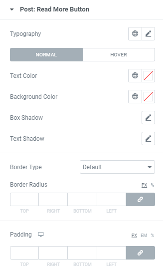
Typography: Set a Typography using settings from the dropdown.
Text Color: Choose a Text Color from a color palette or dynamic tags. (for Normal and Hover modes)
Background Color: Choose a Background Color from a color palette or dynamic tags.(for Normal and Hover modes)
Box Shadow: Choose desired settings from the dropdown.(for Normal and Hover modes)
Text Shadow: Choose desired settings from the dropdown.
Border Type: Choose a Border Type from the dropdown and set it.
Border Radius: Set a border radius to ‘Read More’ button.
Padding: Set padding for desktop, tablet and mobile.
Widget Lazy Load Preloader Type Icon
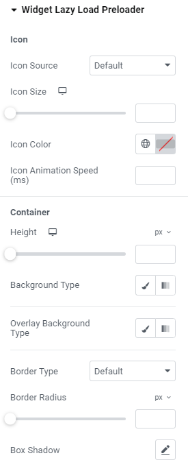
Icon
Icon Source: Choose default or custom icon.
Icon Size: Set the icon size for widescreen, desktop, tablet portrait and mobile portrait modes.
Icon Color: Choose the icon color.
Icon Animation Speed (ms): Set the icon animation speed in milliseconds.
Container
Height: Set the container height for widescreen, desktop, tablet portrait and mobile portrait modes.
Background Type: Choose the container background type between Classic and Gradient and set it.
Overlay Background Type: Choose the container overlay background type between Classic and Gradient and set it.
Border Type: Choose the border type from the dropdown.
Border Radius: Set a desired border radius.
Box Shadow: Choose desired settings from the dropdown.
Widget Lazy Load Preloader Type Grid
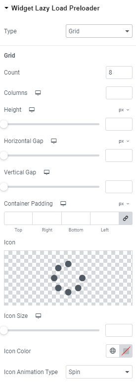
Grid
Count: Choose the number of icons that should be displayed.
Columns: Add the number of columns the icons should be shown for widescreen, desktop, tablet portrait and mobile portrait modes.
Height: Set the height for widescreen, desktop, tablet portrait and mobile portrait modes.
Horizontal gap: Choose Horizontal gap between elements for widescreen, desktop, tablet portrait and mobile portrait modes.
Vertical gap: Set Vertical gap between elements for widescreen, desktop, tablet portrait and mobile portrait modes.
Container padding: Add Container paddings for widescreen, desktop, tablet portrait and mobile portrait modes.
Icon: Choose the icon from Icon library or upload desired SVG.
Icon size: Set the icon size for widescreen, desktop, tablet portrait and mobile portrait modes.
Icon Color: Choose the icon color.
Icon Animation Type: Choose between none, Blink and Spin types.
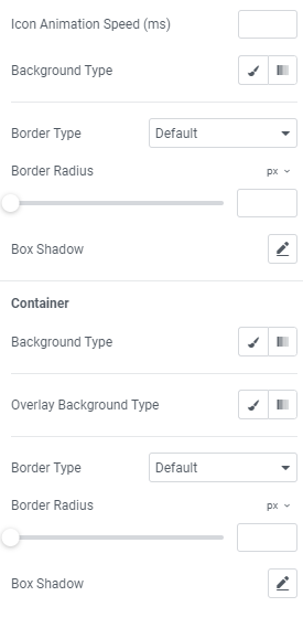
Icon Animation Speed (ms): Set the icon animation speed in milliseconds.
Background Type: Choose the background type between Classic and Gradient and set it.
Border Type: Choose the border type from the dropdown.
Border Radius: Set a desired border radius.
Box Shadow: Choose desired settings from the dropdown.
Container
Background Type: Choose the container background type between Classic and Gradient and set it.
Overlay Background Type: Choose the container overlay background type between Classic and Gradient and set it.
Border Type: Choose the border type from the dropdown.
Border Radius: Set a desired border radius.
Box Shadow: Choose desired settings from the dropdown.
Advanced
Set the Advanced options that are applicable to this widget