Product Reviews Widget
Content
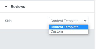
Choose a Skin between Content template and Custom.
Custom Skin
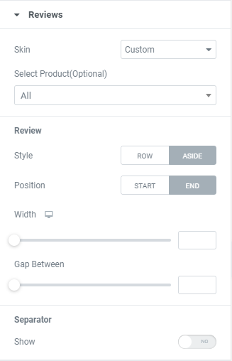
Select Product (optional): Choose whether you want to display reviews from a certain product.
Review
Style: Choose between Row (textarea and inputs in one column) and Aside (separates textarea and inputs to columns) styles.
Position: Choose between Start and End positions. (Reviews will be displayed before or after ‘Add a Review’ form).
Width: Set Review field width for desktop, tablet and mobile.
The option is available if Aside style is chosen.
Gap Between: Set a gap between ‘Add a Review’ form and Reviews.
Separator: Slide to YES to show a Separator between ‘Add a Review’ form and Reviews and set it.
Reviews List
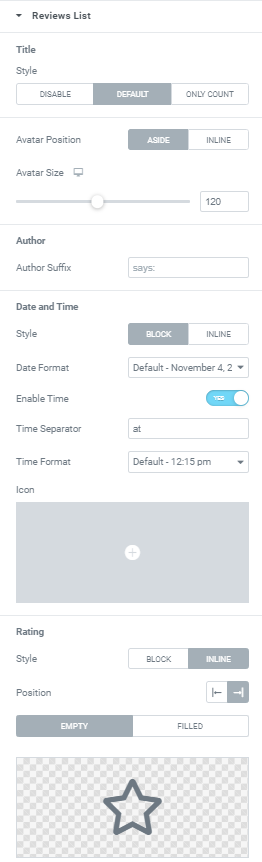
Title
Style: Choose Title style between Default, Only Count (displays amount of reviews) or Disable the title.
Avatar Position: Choose between Aside (avatar stays aside from the content) and Inline (avatar is displaying in line with author and date) positions.
Avatar Size: Set Avatar Size for desktop, tablet and mobile.
Author
Author Suffix: Add a Suffix if needed (as an example, “says:..”)
Date and Time
Style: Choose between Block and Inline (date is displaying in line with author) styles.
When Inline position is activated you can also choose where Date should be located between Start and End Positions.
Date Format: Choose a Date format from the dropdown.
Enable Time: Slide to YES to enable Time.
Time Separator: Add desired separator between date and time (for example, ‘at’: July,24,2020 at 9:17 am)
Time Format: Choose Time format from the dropdown.
Icon: Choose the icon to be shown before date from Icon library or upload desired SVG.
Rating
Style: Choose between Block and Inline (Rating is displaying in line with author) styles.
When Inline position is activated you can also choose where ‘Rating’’ should be located between Start and End Positions.
Choose Icons for Empty and Filled Rating stars.
Form
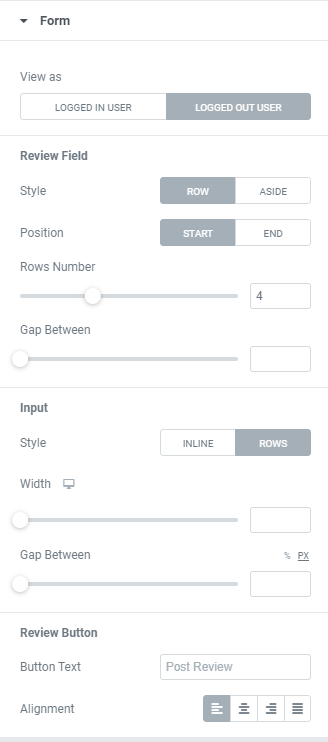
View as: Switch between Logged in\Logged out options to see how the form is displaying for logged in\logged out users.
Review Field
Style: Choose between Row (textarea and inputs in one column) and Aside (separates textarea and inputs to columns) styles.
When Aside style is chosen you can also set Comment field Width for desktop, tablet and mobile.
Position: Choose between Start and End position for Review field. (before or after Name and Email fields)
Number of Rows: Choose a number of rows used on Review field.
Input
Style: Choose between Inline (inputs in line) and Rows (every input on a new line) styles.
When Rows style is chosen you can also set Input fields Width for desktop, tablet and mobile.
Gap Between: Set a Gap between Input fields.
Review Button
Button Text: Add desired button text here.
Alignment: Choose between Right, Center, Left and Justified button alignment.
Advanced options
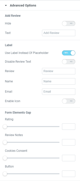
Add Review
Hide: Slide to YES to hide ‘Add Review’ phrase.
Text: Add desired ‘Add Review’ text here.
Label
Use Label Instead of Placeholder: Slide to YES to use labels instead of placeholders.
Disable Review Text: Slide to YES to disable the word ‘Review’ in the form.
Review: Add desired ‘Review’ text here.
Name: Add desired ‘Name’ text here.
Email: Add desired ‘Email’ text here.
Enable Icon: Slide to YES to enable icons in labels and set them.
Form Elements Gap
Rating: Set a gap between Rating and Form.
Review Notes: Set a gap between Review notes and Form.
Cookies Consent: Set a gap between Cookies and Form.
Button: Set a gap between Form and Button.
Navigation
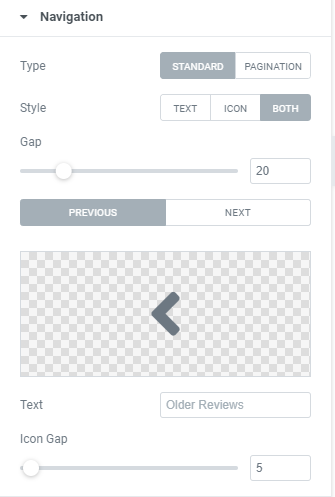
Navigation can be set when ‘Break comments into pages’ option is enabled on Settings/Discussion/Other comment settings field.
Type: Choose between Standard and Pagination types.
Style: Choose navigation type between Text, Icon or Text+Icon and set it.
Text: Add desired text for ‘previous’ and ‘next’ links.
Icon Gap: Set a Gap.
Style
Reviews List Title
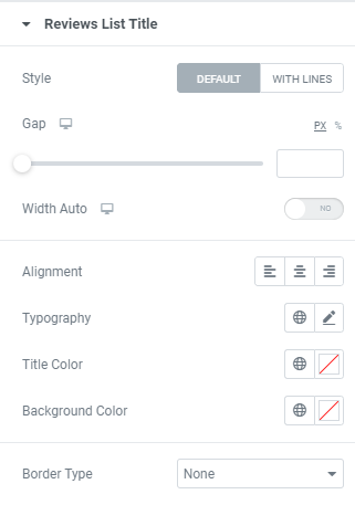
Style: Choose between Default and With Lines (title in the center, lines before and after title) styles.
Default type provides the following settings:
Gap: Set a gap between reviews list title and comments for desktop, tablet and mobile.
Width Auto: Slide to YES to enable auto width for desktop, tablet and mobile.
You can see how it functions when Background Color is set.
Alignment: Choose between Left, Center and Right reviews list title alignment.
Typography: Set a Typography using settings from the dropdown.
Color: Choose a Color from a color palette or dynamic tags.
Background color: Choose a Background color from a color palette or dynamic tags.
Border Type: Choose desired Border Type from the dropdown and set it.
Lines type provides the following settings:
Gap: Set a gap between reviews list title and comments for desktop, tablet and mobile.
Width: Set Title width for desktop, telegram and mobile.
Lines Type: Choose the Lines Type from the dropdown.
Lines Width: Set the Lines width for desktop, telegram and mobile.
Lines Color: Choose Lines Color from a color palette or dynamic tags.
Border Gap: Set a gap between lines and title for desktop, tablet and mobile.
Typography: Set a Typography using settings from the dropdown.
Title Color: Choose Title Color from a color palette or dynamic tags.
Review
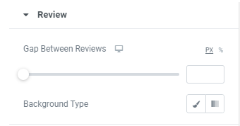
Gap Between Reviews: Set a gap between reviews for desktop, tablet and mobile.
Background Type: Choose a background type between Classic and Gradient and set it.
Avatar
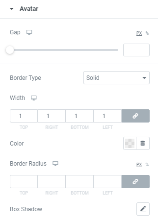
Gap: Set a gap between Avatar and other elements for desktop, tablet and mobile.
Border Type: Choose desired Border Type from the dropdown and set it.
Author
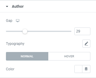
Gap: Set a gap between Author and other elements for desktop, tablet and mobile.
Typography: Set a Typography using settings from the dropdown.
Color: Choose a Color from a color palette or dynamic tags. (for Normal and Hover modes)
For Hover Mode you can also set Transition duration, i.e. choose the amount of time to transition from one filter setting to the other when hovering over the Author.
Rating
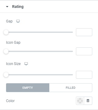
Gap: Set a gap between Rating and other elements.
Icon Gap: Set a gap between rating icons.
Icon Size: Set a size for rating icons for desktop, tablet and mobile.
Color: for Empty and Filled rating icons
Date
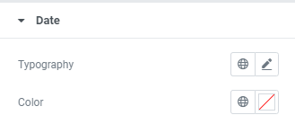
Typography: Set a Typography using settings from the dropdown.
Color: Choose a Color from a color palette or dynamic tags.
Content
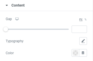
Gap: Set a gap between Review content and other elements.
Typography: Set a Typography using settings from the dropdown.
Color: Choose a Color from a color palette or dynamic tags.
Form Title
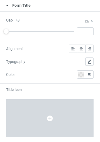
Gap: Set a gap between Form Title and other elements.
Alignment: Choose between Left, Center or Right Title alignment.
Typography: Set a Typography using settings from the dropdown.
Color: Choose a Color from a color palette or dynamic tags.
Title Icon: Choose the icon to be shown before Form Title from Icon library or upload desired SVG and set it.
Navigation
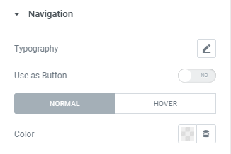
Typography: Set a Typography using settings from the dropdown.
Use as Button: Slide to YES to show navigation link as a button and set it.
Color: Choose a Color from a color palette or dynamic tags. (for Normal and Hover modes)
For Hover Mode you can also set Transition duration, i.e. choose the amount of time to transition from one filter setting to the other when hovering over navigation link.
Form
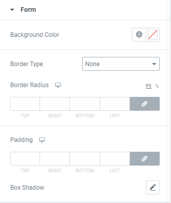
Background color: Choose a Background color from a color palette or dynamic tags.
Border Type: Choose desired Border Type from the dropdown and set it.
Border Radius: Set a border radius to the form.
Padding: Set paddings to the form.
Box Shadow: Choose desired settings from the dropdown.
Form Elements
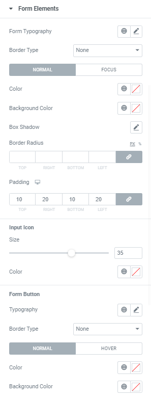
Form Typography: Set a Typography using settings from the dropdown.
Border Type: Choose desired Border Type from the dropdown and set it.
Color: Choose a Color from a color palette or dynamic tags. (for Normal and Focus modes)
Background Color: Choose a Background Color from a color palette or dynamic tags. (for Normal and Focus modes)
For Focus Mode you can also set Transition duration, i.e. choose the amount of time to transition from one filter setting to the other.
Box Shadow: Choose desired settings from the dropdown.
Border Radius: Set a border radius to the field.
Padding: Set paddings to the field.
Input Icon
Size: Set desired Icon size here.
Color: Choose a Color from a color palette or dynamic tags.
Form Button
Typography: Set a Typography using settings from the dropdown.
Border Type: Choose desired Border Type from the dropdown and set it.
Color: Choose a Color from a color palette or dynamic tags. (for Normal and Hover modes)
Background Color: Choose a Background Color from a color palette or dynamic tags. (for Normal and Hover modes)
For Hover Mode you can also set Transition duration, i.e. choose the amount of time to transition from one filter setting to the other.
Box Shadow: Choose desired settings from the dropdown.
Border Radius: Set a border radius to the field.
Padding: Set paddings to the field.
Additional Form Fields
Rating Label Gap: Set a Gap between rating label and other elements.
Color: Choose a Color from a color palette or dynamic tags.
Typography: Set a Typography using settings from the dropdown.
‘Logged in as’ Hover Color: Choose a Color from a color palette or dynamic tags.
Advanced
Set the Advanced options that are applicable to this widget