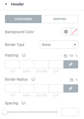
Container
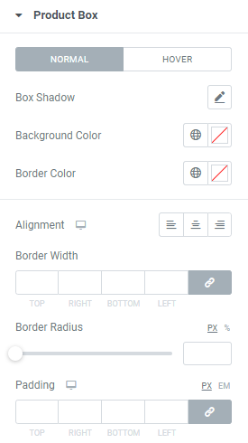
Background Color: Choose background color from a color palette or Global colors.
Border Type: Choose the desired Border Type from the dropdown and set it.
Padding: Set padding for desktop, tablet and mobile.
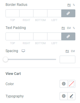
Border Radius: Set the needed border radius for desktop, tablet and mobile.
Spacing: Set the spacing between header and products for desktop, tablet and mobile.
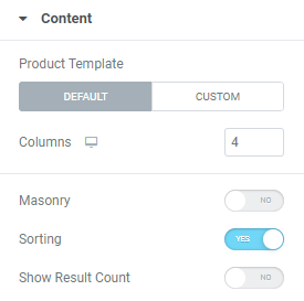
Result count
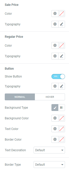
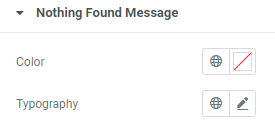
Text Color: Choose a text color from a color palette or Global colors.
Typography: Set a Typography using settings from the dropdown.
Sorting
Text Color: Choose a text color from a color palette or Global colors.
Background Color: Choose background color from a color palette or Global colors.
Typography: Set a Typography using settings from the dropdown.
Padding: Set padding here.
Border Type: Choose the desired Border Type from the dropdown and set it.
Border Radius: Set the needed border radius for desktop, tablet and mobile.