Registration Form Widget
Use a Registration Form widget to create Registration forms on your site.
To use the widget please enable the “Anyone can register” option on a WordPress settings.

Content
Register Form settings

The form allows users to add First Name, Last Name and Website fields and choose whether these fields are Optional or Required.
Log In: Slide to YES to enable the Login button and add the needed URL.
Login button Position: Choose Login button Position between Left, Bottom or Right.
Label: Slide to SHOW to enable a form’s labels.
Placeholder: Slide to SHOW to enable placeholder text.
Logged in message: Slide to SHOW to enable Logged in message.
Rows Gap: Set desired Gap between rows.
Additional Options

User Role: Choose a User Role from a dropdown.
Sending Password After Registration: Choose where a password should be sent (Email or Password Reset page)
Redirect after logout: Slide to ON to add a page URL where you’ll be redirected after logout. Please note that due to security reasons you can use only your current domain here.
Set needed Labels for Username and Email and add desired Register Button Text and Login Text.
Valid Message

Add message texts that will be shown in case the form is filled correctly/incorrectly.
Logged in Message

Add needed Text and Link text here (as an example, “You are logged in as…(Logout)
Style
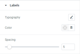
Labels

Typography: Set a Typography using settings from the dropdown.
Color: Choose Labels’ color from a color palette or dynamic tags.
Spacing: Set desired spacing between labels.
Fields

Typography: Set a Typography using settings from the dropdown.
Background Color: Choose a Background color from a color palette or dynamic tags. (for Normal and Focus modes)
Border Color: Choose a Border color from a color palette or dynamic tags.(for Normal and Focus modes)
Box Shadow: Choose desired settings from the dropdown.(for Normal and Focus modes)
Border Type: Choose a Border Type from the dropdown and set it.
Border Radius: Set Border Radius to fields.
Padding: Set paddings for desktop, tablet and mobile.
Button

Typography: Set a Typography using settings from the dropdown.
Text Color: Choose Button’s Text color from a color palette or dynamic tags.(for Normal and Focus modes)
Background Color: Choose a Background color from a color palette or dynamic tags.(for Normal and Focus modes)
Border Color: Choose a Border color from a color palette or dynamic tags.(for Normal and Focus modes)
Box Shadow: Choose desired settings from the dropdown.(for Normal and Focus modes)
Border Type: Choose a Border Type from the dropdown and set it.
Border Radius: Set needed Border Radius.
Padding: Set paddings for desktop, tablet and mobile.
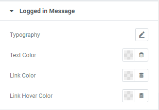
Logged in Message

Typography: Set a Typography using settings from the dropdown.
Text Color: Choose a Text color from a color palette or dynamic tags.
Link Color: Choose a Link color from a color palette or dynamic tags.
Link Hover Color: Choose a Link Hover color from a color palette or dynamic tags.
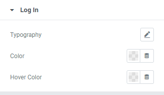
Log In

Typography: Set a Typography using settings from the dropdown.
Color: Choose a Login link color from a color palette or dynamic tags.
Hover Color: Choose a Login Hover color from a color palette or dynamic tags.
Message

Valid
Color: Choose a Valid Message color from a color palette or dynamic tags.
Background Color: Choose a Valid Message Background color from a color palette or dynamic tags.
Border Color: Choose a Valid Message Border color from a color palette or dynamic tags.
Invalid
Color: Choose an Invalid Message color from a color palette or dynamic tags.
Background Color: Choose an Invalid Message Background color from a color palette or dynamic tags.
Border Color: Choose an Invalid Message Border color from a color palette or dynamic tags.
Typography: Set a Typography using settings from the dropdown.
Alignment: Choose a Message Alignment between Left, Center or Right.
Border Type: Choose a Border Type from the dropdown and set it.
Padding: Set a Message padding for desktop, tablet and mobile.
Margin: Set a Margin between Messages.
Advanced
Set the Advanced options that are applicable to this widget