Search Widget

Use the Search Widget to easily embed Search on your page.

Content

General settings

Choose between Classic and Popup search types and add a Search form placeholder.

Classic search type settings

View: Choose between Link, Button or None.

Link View allows users to choose the icon from Icon library or upload desired SVG.

Button View allows users to choose between Icon, Text or Icon+Text types and set them.

Popup search type settings
Popup Trigger

Trigger type: Choose between Link and Button Trigger types.

View: Choose between Icon, Text and Icon + Text views and set them.

Popup Settings

Popup description: Slide to YES to enable Popup description and add it to a Popup description Text field.

Close With Click on Overlay: Close popup upon click/tap on overlay. The overlay layer is the area outside the popup container.

Close by ECS Button Click: Slide to YES to enable Close by ECS Button Click.

Disable scroll: Slide to YES to disable content scroll.

Show Effect: Choose the effect from the dropdown.

Popup Close

Close Icon: Choose the icon from Icon library or upload desired SVG.

Icon Position: Choose between Left and Right icon position.

Icon Size: Set the icon size for desktop, tablet and mobile.

Submit Button

View: Choose between Link, Button or None.

Link View allows users to choose the icon from Icon library or upload desired SVG.

Button View allows users to choose between Icon, Text or Icon+Text types and set them.

Style

Popup Trigger (for Popup Search type only)

View: Choose between Left, Center and Right alignment for desktop, tablet and mobile.

Color: Set a Color for Normal and Hover modes.

Background Color: Set a Color for Normal and Hover modes.

Box Shadow: Choose desired settings from the dropdown for Normal and Hover modes.

Icon Size: Set the icon size for desktop, tablet and mobile.

Padding: Set paddings for desktop, tablet and mobile.

Border Type: Choose desired Border Type from the dropdown and set it.

Border Radius: Set a border radius for desktop, tablet and mobile.

Popup Content (for Popup Search type only)

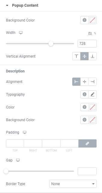
Background Color: Set a Background color via color palette or dynamic tags.

Width: Set a popup search field width for desktop, tablet and mobile.

Vertical Alignment: Choose between Top, Middle and Bottom vertical alignment for a search field.
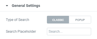
Description

Alignment: Choose between Left, Center and Right description alignment.

Typography: Set Typography using settings from the dropdown.

Color: Set a description color via color palette or dynamic tags.

Background Color: Set a description background color via color palette or dynamic tags.

Padding: Set the Padding for desktop, tablet and mobile.

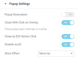
Gap: Set a gap between description and a search field for desktop, tablet and mobile.

Border Type: Choose Border Type from the dropdown and set it.

Input Field

Typography: Set Typography using settings from the dropdown.

Color: Set a Color via color palette or dynamic tags. ( for Normal and Focus modes)

Background Color: Set a background color via color palette or dynamic tags. ( for Normal and Focus modes)

Box Shadow: Choose desired settings from the dropdown.( for Normal and Focus modes)

Border Type: Choose Border Type from the dropdown and set it.

Placeholder color: Set a Close via color palette or dynamic tags.

Padding: Set the Padding for desktop, tablet and mobile.

Border Radius: Set a Border Radius for desktop, tablet and mobile.

Input Icon: Slide to SHOW to enable Input icon.

Input Icon

Choose the icon from Icon library or upload desired SVG.

Color: Set the icon color via color palette or dynamic tags.

Size: Set the icon size for desktop, tablet and mobile.

Side Gap: Set the icon side gap for desktop, tablet and mobile.

Submit Button

Gap: Set a gap between submit button and a search field for desktop, tablet and mobile.

Color: Set a button color via color palette or dynamic tags. (for Normal and Hover modes)

Background Color: Set a button background color via color palette or dynamic tags. (for Normal and Hover modes)

Box Shadow: Choose desired settings from the dropdown.( for Normal and Focus modes)

Border Type: Choose Border Type from the dropdown and set it.

Border Radius: Set a Border Radius for desktop, tablet and mobile.

Min Size: Set the button min size for desktop, tablet and mobile.

Icon Size: Set the icon size for desktop, tablet and mobile.

Popup Close (for Popup Search type only)

Color: Set a Close icon color via color palette or dynamic tags. ( for Normal and Hover modes)

Background Color: Set a Close icon background color via color palette or dynamic tags. ( for Normal and Hover modes)

Box Shadow: Choose desired settings from the dropdown.( for Normal and Hover modes)

Border Type: Choose Border Type from the dropdown and set it.

Border Radius: Set a Border Radius for desktop, tablet and mobile.

Padding: Set a Padding for desktop, tablet and mobile.

Margin: Set a Margin for desktop, tablet and mobile.

Advanced

Set the Advanced options that are applicable to this widget