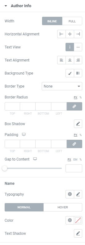
Testimonials slider widget

Use the widget to add testimonials slider to a page.

Content

testimonials slider

Items: Add testimonials using +ADD ITEM button or copying items that are already added and set them. You can add testimonial title, text, author info and rating.

Slider Effect: Choose desired effect from the dropdown. The choice is between Slide, Fade and Flip.

Slider Direction: Choose between Horizontal and Vertical slider directions.

When Horizontal Slider Direction is chosen you can also set Slides Per View, i.e. the needed amount of slides that should be displayed per view for desktop, tablet and mobile.

Vertical Slider Direction allows to set the Slider Height for desktop, tablet and mobile.  

Layout

testimonial slider layout

Alignment: Choose between Start, Center and End testimonial alignment.

Layout: Choose between Vertical Top, Vertical Bottom, Horizontal Start and Horizontal End layouts.

When Vertical Top and Vertical Bottom layouts are chosen you can also set

Avatar Placement (With Author or Separate).

Separate Avatar Placement allows to choose between Opposite, Start and End Avatar Position.

 When Horizontal Start and Horizontal End layouts are chosen you can also set

Side Area (i.e. area where author name and subtitle are displayed).

Width: Set the Side Area Width for desktop, tablet and mobile.

Gap: Set the Gap between Side Area and the content for desktop, tablet and mobile.

Vertical Alignment: Set the Side Area Vertical Alignment (Top, Center or Bottom) for desktop, tablet and mobile.      

Avatar Position: Choose between Top, Bottom, Start and End avatar position.

Rating

testimonial

Scale: Choose between 5 and 10 ‘stars’ scale.

Type:  Choose between Icon and Text types.

Icon: Choose Empty and Filled icons from Icon library or upload desired SVG.

For correct displaying variations of the same icon should be used (eg.: star icons both for empty and filled options).

You can also choose either an Empty or Filled icon to be used for both states.

Text: Add desired delimiter

Slider options

testimonial slider options 2

Autoplay: Slide to YES to enable Autoplay.

Autoplay Speed: Set desired Autoplay speed here.

Animation Speed: Set how fast slides should slide. (in milliseconds)

Active Slide: Choose the slide that should be shown first.        Infinite Loop: Slide to YES to enable Infinite Loop.

Mousewheel Control: Slide to YES to slide slides with a Mouse wheel.

Free Positioning: Slide to Yes to enable free slides positioning. When this mode is enabled slides don’t have fixed positions, like usual scroller.

Scrollbar: Slide to YES to enable a scrollbar.

Navigation: Choose slides’ Navigation between None, Bullets, Progressbar and Fraction.

Navigation can be set only when the Scrollbar is deactivated.

Show Arrows: Slide to YES to show Arrows and set them.

Style

testimonial slider style

Alignment: Choose between Start, Center and End testimonial content alignment. 

Background Type: Choose between Classic and Gradient background type and set it.

Border Type: Choose Border Type from the dropdown and set it.

Border Radius: Set a border radius to the content box.

Box Shadow: Choose desired settings from the dropdown.

Padding: Set paddings to the content box for desktop, tablet and mobile.

Triangle: Set the Triangle using settings from the dropdown.

You can set Shape, Direction, Offset, Color and Size.

Text

Typography: Set a Typography using settings from the dropdown.

Color: Choose a Text Color from a color palette or dynamic tags.

Text Shadow: Choose desired settings from the dropdown.

Title

Title HTML tag: Choose needed tag from the dropdown.

Typography: Set a Typography using settings from the dropdown.

Color: Choose a Title Color from a color palette or dynamic tags.

Text Shadow: Choose desired settings from the dropdown.

Gap Between: Set the gap between Text and Title.

Author Info

testimonial style 2

Author Info

Width: Choose between Inline and Full author box width.

Horizontal Alignment: Choose between Start, Center and End author box Horizontal Alignment.

Text View: Choose between Vertical and Horizontal Text view.

Vertical Text view allows you to choose between Start, Center and End Text           Alignment.

Horizontal Text view allows to set desired Text Delimiter.

Background Type: Choose between Classic and Gradient background type and set it.

Border Type: Choose Border Type from the dropdown and set it.

Border Radius: Set a border radius to the author info box.

Box Shadow: Choose desired settings from the dropdown.

Padding: Set paddings to the author info box for desktop, tablet and mobile.

Gap to Content: Set a gap between Content and Author info for desktop, tablet and mobile.

Name

Typography: Set a Name Typography for Normal and Hover modes using settings from the dropdown.

Color: Choose a Name Color from a color palette or dynamic tags.

Text Shadow: Choose desired settings from the dropdown.

Subtitle

Typography: Set a Subtitle Typography for Normal and Hover modes using settings from the dropdown.

Color: Choose a Subtitle Color from a color palette or dynamic tags.

Text Shadow: Choose desired settings from the dropdown.

Gap Between: Set a gap between Name and Subtitle for desktop, tablet and mobile.
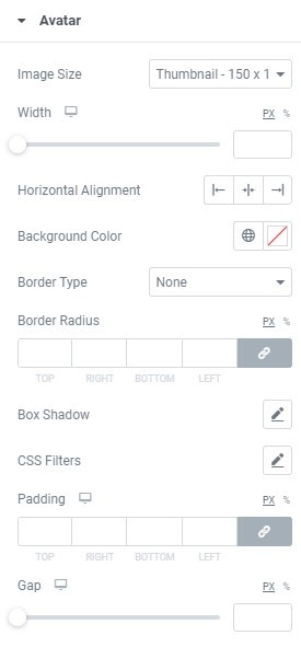
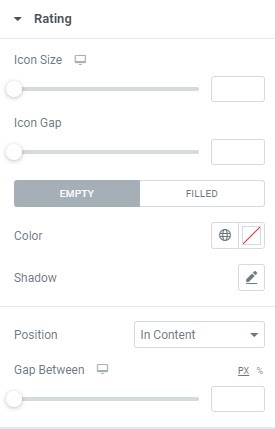
Avatar

testimonial avatar

Image Size: Choose the image size from the dropdown.

Width: Set the width for desktop, tablet and mobile.

Horizontal Alignment: Choose between Start, Center and End horizontal alignment.

Background Color: Choose the Avatar background color.

Border Type: Choose Border Type from the dropdown and set it.

Border Radius: Set a border radius to the avatar.

CSS Filters: Use CSS filters to set Blur, Brightness, Contrast, Saturation and Hue.

Box Shadow: Choose desired settings from the dropdown.

Padding: Set paddings to the author info box for desktop, tablet and mobile.

Gap: Set a gap between Avatar and content for desktop, tablet and mobile.

Rating

testimonials style rating

Icon Size: Set the Icon size for desktop, tablet and mobile.

Icon Gap: Set the Gap between icons.

Color: Set the icons Color (for empty and filled modes).

Shadow: Set the icons Shadow.

Position: Choose desired Icons position from the dropdown or use custom settings.

Gap Between: Set a gap between Icons and content.


Icon

testimonial style icon

Icon: Choose the Icon from Icon library or upload desired SVG.

Size: Set the Icon size for desktop, tablet and mobile.

Color: Set the Icon color.

Shadow: Set the icon Shadow.

Position: Choose desired Icon position from the dropdown or use custom settings.

Gap: Set a gap between Icon and content.

Slider Layout

testimonial slider layout style

Space Between: Set a space between slides for desktop, tablet and mobile.

Width: Set slides’ width for desktop, tablet and mobile.

Padding: Set slides’ paddings for desktop, tablet and mobile.

Slider Arrows

testimonials slider arrows style

Icon Color: Choose Icon Color from a color palette or dynamic tags. (for Normal and Hover modes)

Background Color: Choose Icon Background Color from a color palette or dynamic tags. (for Normal and Hover modes)

Box Shadow: Choose desired settings from the dropdown. (for Normal and Hover modes)

Icon Size: Set Icon size for desktop, tablet and mobile.

Arrows Box Width: Set Arrows Box Width for desktop, tablet and mobile.

Arrows Box Height: Set Arrows Box Height for desktop, tablet and mobile.

Border Radius: Set Arrows Box border radius for desktop, tablet and mobile.

Border Type: Choose a Border Type from the dropdown and set it.

Padding: Set padding for desktop, tablet and mobile.

Container

Position: Choose between Horizontal and Vertical positions.

Horizontal alignment: Choose horizontal alignment between Start, Center, End and Space between for desktop, tablet and mobile.  

Vertical alignment: Choose vertical alignment between Top, Center and Bottom for desktop, tablet and mobile.

Margin: Set margins for desktop, tablet and mobile.                     

Advanced

Set the Advanced options that are applicable to this widget