Title Widget

Use the widget to set Titles in accordance to design needs.

Content

Add a Title manually or using Dynamic Tags and a Link where this Title should lead.

HTML Tag: Set the Title’s tag to H1-H6, Div, Span or Paragraph

Alignment: Choose between Left, Center, Right or Justified Title alignment for desktop, tablet and mobile.

Use Rows: Slide to YES to enable rows and choose the Number of rows the Title should occupy. (for example in case of Dynamic title usage)

Style

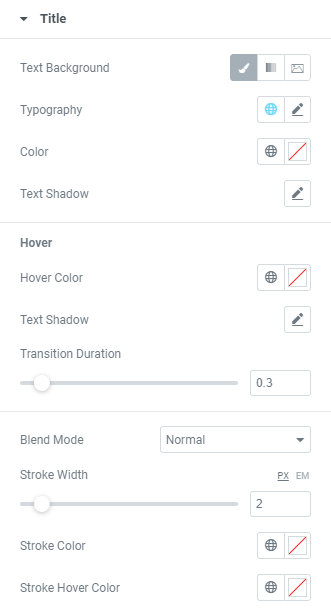
Text Background: Choose the Text Background between Default, Gradient and Image and set it.

Typography: Set a Typography using settings from the dropdown.

Color: Choose a Title color from a color palette or dynamic tags.

Text Shadow: Choose desired settings from the dropdown.

Hover

Hover Color: Set a Title Hover color from a color palette or dynamic tags

Text Shadow: Choose desired settings from the dropdown.

Transition duration: Set the amount of time to transition from one filter setting to the other when hovering over the Title.

Blend Mode: Select from multiple layer effects including Normal, Multiply, Screen, Overlay, etc.

Stroke Width: Set desired Stroke width.

Stroke Color: Choose a Stroke color from a color palette or dynamic tags.

Stroke Hover Color: Choose a Stroke Hover color from a color palette or dynamic tags.

Pointer Animation

Hover effect: Choose Hover effect from the dropdown.

Animation: Choose Animation from the dropdown.

Line size: Set a Line size here.

Use Gradient: Slide to YES to enable gradient and set it.

Color: Choose a Pointer color from a color palette or dynamic tags.

Transition duration: Set the amount of time to transition from one filter setting to the other when hovering over the Title.

Advanced

Set the Advanced options that are applicable to this widget