Video Playlist Widget

Use the Video Playlist Widget to easily embed video playlists on your page.

Content

Video Playlist

Add needed amount of items using +ADD ITEM button or copying items that are already added

Add Video URL, Title and Author/Subtitle for the item

Aspect Ratio: Change the video’s aspect ratio. Choices include: 1:1, 3:2, 4:3, 16:9, 21:9, and 9:16

Autoplay: Slide to YES to automatically play the video on page load.

Mute: Slide to YES to Mute the video.

Loop: Slide to YES to Loop the video.

Choose Cover: Add desired Cover Image.

Cover Size: Choose Cover size from the dropdown.

List

Orientation: Choose between Vertical and Horizontal playlist orientation.

Position: Choose between Left and Right playlist position.

Heading: Slide to SHOW to enable List heading.

When Heading is enabled you can enable or disable Videos Counter and add desired Heading Text and Counter Suffix to corresponding fields.

Numbers: Slide to SHOW to add Item numbers.

Hide on: Choose resolution when Item numbers should be hidden. The choice is between Tablet, Mobile or Both tablet and mobile.

Subtitle

Hide on: Choose resolution when Subtitle should be hidden. The choice is between Tablet, Mobile or Both tablet and mobile.

Duration: Slide to SHOW to enable Item duration.

Hide on: Choose resolution when Item duration should be hidden. The choice is between Tablet, Mobile or Both tablet and mobile.

Style

List

Width: Set Playlist width for desktop and tablet.

Background: Set Background color via color palette or dynamic tags.

Padding: Set paddings for desktop, tablet and mobile.

Max height on mobile: Set desired playlist’s height for mobile.

Heading:

Background: Set Background color via color palette or dynamic tags.

Padding: Set paddings for desktop, tablet and mobile.

Gap: Set a Gap between List items and Heading for desktop, tablet and mobile.

Set desired Color and Typography for Title and Counter.

List Item

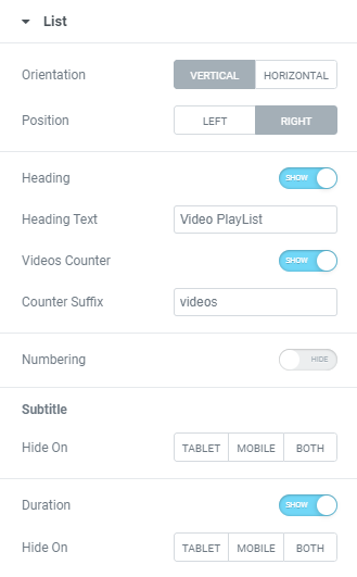
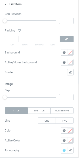
Gap Between: Set a Gap between List items.

Padding: Set paddings for desktop, tablet and mobile.

Background: Set Background color via color palette or dynamic tags.

Active/Hover Background: Set Active/Hover Background color via color palette or dynamic tags.

Border: Set a Border using settings from the dropdown.
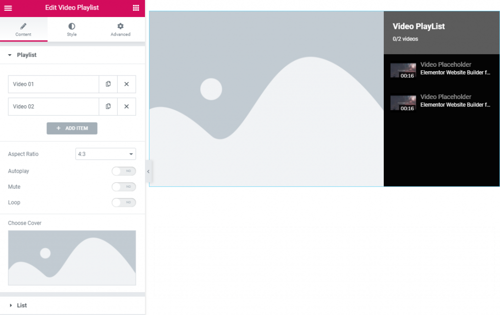
Image

Gap: Set a Gap between Image and Title.

Hide on: Choose resolution when Image should be hidden. The choice is between Tablet, Mobile or Both tablet and mobile.

Title

Line: Choose how a Title should be displayed: in One or Two lines.

Color: Set Title color via color palette or dynamic tags.

Active Color: Set Title Active color via color palette or dynamic tags.

Typography: Set a Typography using settings from the dropdown.

Subtitle

Line: Choose how a Subtitle should be displayed: in One or Two lines.

Color: Set Subtitle color via color palette or dynamic tags.

Active Color: Set Subtitle Active color via color palette or dynamic tags.

Typography: Set a Typography using settings from the dropdown.

Gap: Set a Gap between Title and Subtitle.

Numbering

Color: Set Numbering color via color palette or dynamic tags.

Active Color: Set Numbering Active color via color palette or dynamic tags.

Typography: Set a Typography using settings from the dropdown.

Gap: Set a Gap between Numbering and Image.

Advanced

Set the Advanced options that are applicable to this widget