WPForms Widget
Use a WPForms widget to add contact forms on your site.
To use the widget please make sure to install and activate WPForms plugin.
Create needed contact form using WPForms plugin and choose it form from the dropdown.

Style
Form Fields

Typography: Set a Typography using settings from the dropdown.
Color: Choose a Text color from a color palette or dynamic tags. (for Normal and Focus modes)
Background Color: Choose a Background color from a color palette or dynamic tags. (for Normal and Focus modes)
Border Color: Choose a Border color from a color palette or dynamic tags.(for Normal and Focus modes)
Box Shadow: Choose desired settings from the dropdown.(for Normal and Focus modes)
Fields Text Alignment: Choose between Left, Center and Right alignment for a text added to a contact form fields.
Textarea Height: Set needed Height for desktop, tablet and mobile.
Border Type: Choose a Border Type from the dropdown and set it.
Border Radius: Set Border Radius to fields.
Margin: Set margin between form fields for desktop, tablet and mobile.
Padding: Set padding for desktop, tablet and mobile.
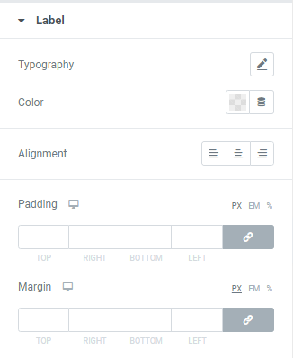
Label

Typography: Set a Typography using settings from the dropdown.
Color: Choose a Label Color from a color palette or dynamic tags.
Alignment: Choose between Left, Center or Right Label alignment.
Padding: Set padding for desktop, tablet and mobile.
Margin: Set margin for desktop, tablet and mobile.
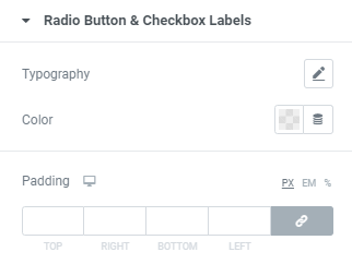
Radio Button and Checkbox Labels

Typography: Set a Typography using settings from the dropdown.
Color: Choose a Text Color from a color palette or dynamic tags.
Padding: Set padding between checkbox/radio button and text for desktop, tablet and mobile.
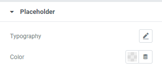
Placeholder

Typography: Set a Typography using settings from the dropdown.
Color: Choose a Placeholder Color from a color palette or dynamic tags.
Submit Button

Typography: Set a Typography using settings from the dropdown.
Background Type: Choose between Classic and Gradient Background type and set it (for Normal and Hover modes)
Text Color: Choose a Text color from a color palette or dynamic tags. (for Normal and Hover modes)
Border Color: Choose a Border color from a color palette or dynamic tags.(for Normal and Hover modes)
Box Shadow: Choose desired settings from the dropdown.(for Normal and Hover modes)
Width: Set the Button width for desktop, tablet and mobile.
Min Height: Set the Button height for desktop, tablet and mobile.
Border Type: Choose a Border Type from the dropdown and set it.
Border Radius: Set Border Radius to Submit button.
Margin: Set margin for desktop, tablet and mobile.
Padding: Set padding for desktop, tablet and mobile.
Advanced
Set the Advanced options that are applicable to this widget