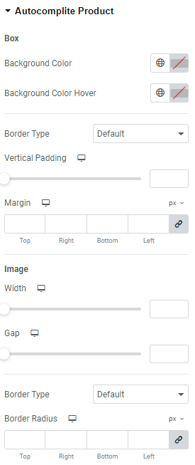
Box
Background Color: Set the needed background color here.
Background Color Hover: Set background color on hover here.
Border Type: Choose Border Type from the dropdown and set it.
Vertical Padding: Set Vertical Padding for widescreen, desktop, tablet portrait and mobile portrait.
Margin: Set margins for widescreen, desktop, tablet portrait and mobile portrait.
Image
Width: Choose the image width for widescreen, desktop, tablet portrait and mobile portrait.
Gap: Set the gap for widescreen, desktop, tablet portrait and mobile portrait.
Border Type: Choose Border Type from the dropdown and set it.
Border Radius: Set Border Radius for widescreen, desktop, tablet portrait and mobile portrait.
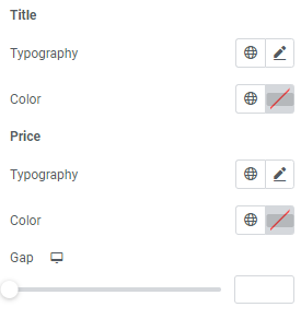
Title
Typography: Set Typography using settings from the dropdown.
Color: Set the title color here.
Price
Typography: Set Typography using settings from the dropdown.
Color: Set the price color here.
Gap: Set the gap for widescreen, desktop, tablet portrait and mobile portrait.