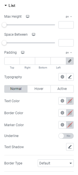
Max Height: Set the list Max Height for widescreen, desktop, tablet portrait and mobile portrait views.
Space between: Set a space between items for widescreen, desktop, tablet portrait and mobile portrait views.
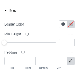
Padding: Set paddings for widescreen, desktop, tablet portrait and mobile portrait views.
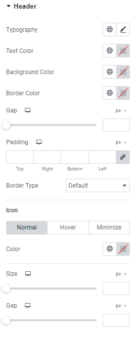
Typography: Set Typography using settings from the dropdown.
Text Color: Choose the text color here (for Normal. Hover and Active modes).
Border Color: Set the border color here (for Normal. Hover and Active modes).
Marker Color: Choose the marker color here (for Normal. Hover and Active modes).
Underline: Slide to YES to underline the active item.
Text Shadow: Choose desired settings from the dropdown.
Border Type: Choose a border type from the dropdown and set it.
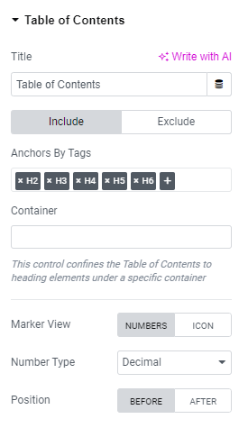
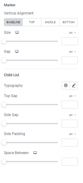
Marker
Vertical Alignment: Choose between Baseline, Top, Middle and Bottom alignment.
Size: Set a marker size for widescreen, desktop, tablet portrait and mobile portrait views.
Gap: Set a gap between marker and heading for widescreen, desktop, tablet portrait and mobile portrait views.
Child List
Typography: Set Typography using settings from the dropdown.
Top Gap: Set a child list top gap here.
Side Gap: Set a child list side gap here.
Side Padding: Set a child list side padding here.
Space between: Set a space between child list items for widescreen, desktop, tablet portrait and mobile portrait views.