Add to Cart Widget
Use Add to Cart widget to easily add an ‘Add to Cart’ button on your site.
When using WPC Variation Swatches for WooCommerce plugin there are additional options for displaying variations in the Add to Cart widget settings. Learn more: Add to Cart Widget with WPC Variation Swatches
Style
Button
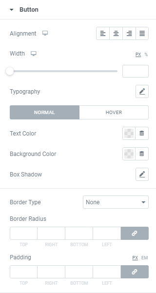
Alignment: Choose between Left, Center, Right or Justified button alignment.
Width: Set desired button width for desktop, tablet and mobile.
Typography: Set a Typography using settings from the dropdown.
Text Color: Choose a Text Color from a color palette or dynamic tags. (for Normal and Hover modes)
Background Color: Choose a Background Color from a color palette or dynamic tags. (for Normal and Hover modes)
For Hover Mode you can also set Transition duration, i.e. choose the amount of time to transition from one filter setting to the other on hover.
Box Shadow: Choose desired settings from the dropdown.
Border Type: Choose desired Border Type from the dropdown and set it.
Border Radius: Set a border radius to the button.
Padding: Set paddings to the field.
Quantity
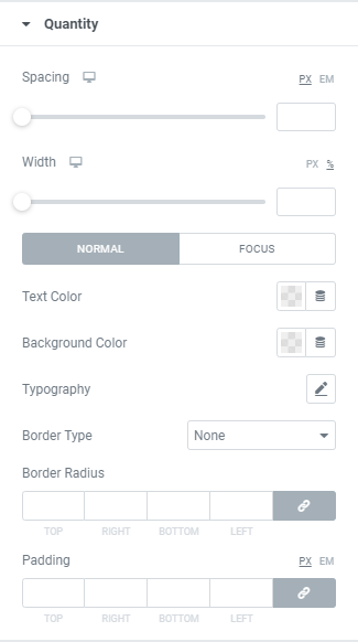
Spacing: Set a Spacing between button and number for desktop, tablet and mobile.
Width: Set desired Quantity field width for desktop, tablet and mobile.
Typography: Set a Typography using settings from the dropdown.
Text Color: Choose a Text Color from a color palette or dynamic tags. (for Normal and Focus modes)
Background Color: Choose a Background Color from a color palette or dynamic tags. (for Normal and Hover modes)
For Hover Mode you can also set Transition duration, i.e. choose the amount of time to transition from one filter setting to the other on hover.
Box Shadow: Choose desired settings from the dropdown.
Border Type: Choose desired Border Type from the dropdown and set it.
Border Radius: Set a border radius to the field.
Padding: Set paddings to the field.
Group and Variations Table
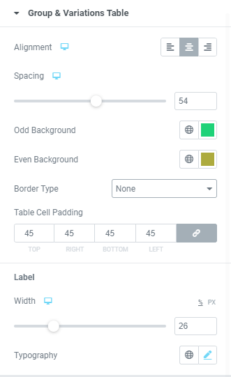
Alignment: Choose between Left, Center and Right alignment for desktop, tablet and mobile.
Spacing: Set the spacing for desktop, tablet and mobile.
Odd line background color: Set desired Odd lines background color here.
Even line background color: Set desired Even lines background color here.
Border Type: Choose desired Border Type from the dropdown and set it.
Table Cell padding: Set paddings to a table cell.
Label
Width: Set a label width for desktop, tablet and mobile.
Typography: Set a Typography using settings from the dropdown.
Variations
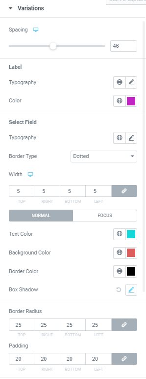
Spacing: Set a spacing between variations and “”Add to Cart” button.
Label
Typography: Set a Typography using settings from the dropdown.
Color: Choose desired label color.
Select Field
Typography: Set a Typography using settings from the dropdown.
Border Type: Choose desired Border Type from the dropdown and set it.
Text Color: Choose a Text color for Normal and Focus modes.
Background Color: Choose Background color for Normal and Focus modes.
Box Shadow: Choose desired settings from the dropdown
For Focus Mode you can also set Transition duration, i.e. choose the amount of time to transition from one filter setting to the other on hover.
Border Radius: Set a border radius to the field.
Padding: Set paddings to the field.
Clear
Gap: Set gap for desktop, tablet and mobile.
Typography: Set a Typography using settings from the dropdown.
Color: Choose a “Clear” color for Normal and Hover modes.
For Hover Mode you can also set Transition duration, i.e. choose the amount of time to transition from one filter setting to the other on hover.
Group
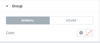
Product title Color: Choose a Product title Color for Normal and Hover modes.
For Hover Mode you can also set Transition duration, i.e. choose the amount of time to transition from one filter setting to the other on hover.
Price
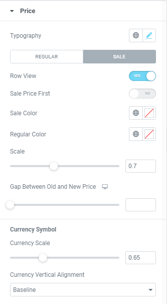
Typography: Set a Typography using settings from the dropdown.
Regular Price
Color: Choose a Regular Price Color.
Sale Price
Row View: Slide to YES to enable the Row View.
Sale Price first: Slide to YES to display a sale price before regular.
Sale Price Color: Choose a Sale Price Color.
Regular Price Color: Choose a Regular Price Color.
Scale: Choose how a regular price size should scale relative to a sale price
Gap between Regular and Sale price: Set a Gap between Regular and Sale price.
Currency Symbol
Scale: Choose how a Currency symbol size should scale relative to a price.
Vertical alignment: Choose a Currency symbol vertical alignment from the dropdown.
Description
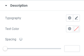
Typography: Set a Typography using settings from the dropdown.
Text Color: Choose a Description Text Color.
Spacing: Set a spacing.
Advanced
Set the Advanced options that are applicable to this widget