Contact Form 7 Widget
Use a Contact Form 7 widget to add contact forms on your site.
To use the widget please make sure to install and activate Contact Form 7 plugin.
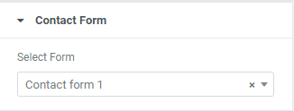
Create a needed contact form using Contact Form 7 plugin and choose it from the dropdown.
Style
Form Fields
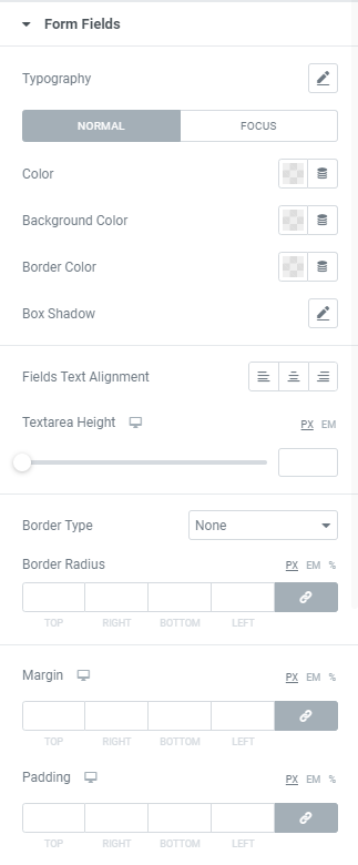
Typography: Set a Typography using settings from the dropdown.
Color: Choose a Text color from a color palette or dynamic tags. (for Normal and Focus modes)
Background Color: Choose a Background color from a color palette or dynamic tags. (for Normal and Focus modes)
Border Color: Choose a Border color from a color palette or dynamic tags.(for Normal and Focus modes)
Box Shadow: Choose desired settings from the dropdown.(for Normal and Focus modes)
Fields Text Alignment: Choose between Left, Center and Right alignment for a text added to a contact form fields.
Textarea Height: Set needed Height for desktop, tablet and mobile.
Border Type: Choose a Border Type from the dropdown and set it.
Border Radius: Set Border Radius to fields.
Margin: Set margin between form fields for desktop, tablet and mobile.
Padding: Set padding for desktop, tablet and mobile.
Label
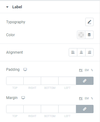
Typography: Set a Typography using settings from the dropdown.
Color: Choose a Label Color from a color palette or dynamic tags.
Alignment: Choose between Left, Center or Right Label alignment.
Padding: Set padding for desktop, tablet and mobile.
Margin: Set margin for desktop, tablet and mobile.
Radio Button and Checkbox Labels
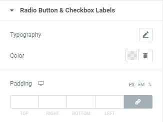
Typography: Set a Typography using settings from the dropdown.
Color: Choose a Text Color from a color palette or dynamic tags.
Padding: Set padding between checkbox/radio button and text for desktop, tablet and mobile.
Placeholder
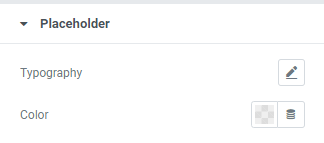
Typography: Set a Typography using settings from the dropdown.
Color: Choose a Placeholder Color from a color palette or dynamic tags.
Submit Button

Typography: Set a Typography using settings from the dropdown.
Background Type: Choose between Classic and Gradient Background type and set it (for Normal and Hover modes)
Text Color: Choose a Text color from a color palette or dynamic tags. (for Normal and Hover modes)
Border Color: Choose a Border color from a color palette or dynamic tags.(for Normal and Hover modes)
Box Shadow: Choose desired settings from the dropdown.(for Normal and Hover modes)
Width: Set the Button width for desktop, tablet and mobile.
Min Height: Set the Button height for desktop, tablet and mobile.
Border Type: Choose a Border Type from the dropdown and set it.
Border Radius: Set Border Radius to Submit button.
Margin: Set margin for desktop, tablet and mobile.
Padding: Set padding for desktop, tablet and mobile.
Errors/Valid

Message Typography: Set a Typography using settings from the dropdown.
Set Colors for Error and Complete messages and choose Messages Alignment between Left, Center or Right.
Border Type: Choose a Border Type from the dropdown and set it.
Message Border Radius: Set Border Radius to messages.
Message Margin: Set margin for desktop, tablet and mobile.
Message Padding: Set padding for desktop, tablet and mobile.
Advanced
Set the Advanced options that are applicable to this widget