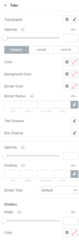
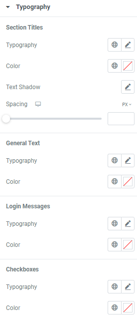
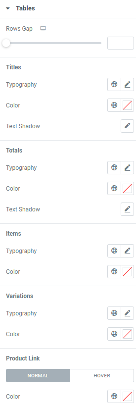
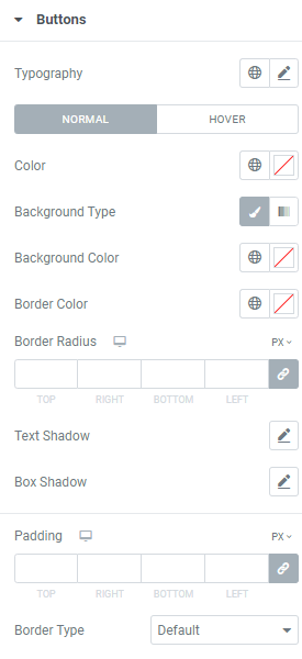
Typography: Set a Typography using settings from the dropdown.
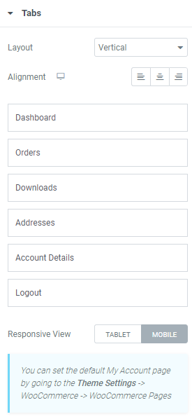
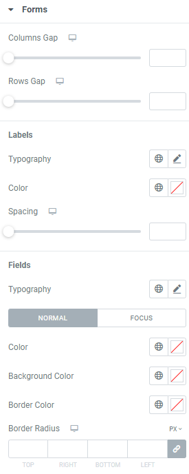
Spacing: Set spacing between tabs and content for desktop, tablet and mobile.
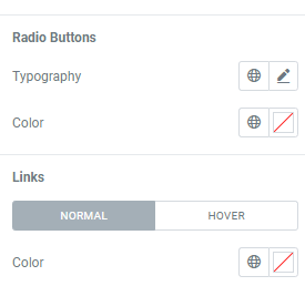
Color: Choose tabs color for Normal,Hover and Active modes.
Background Color: Choose tabs background color for Normal,Hover and Active modes.
Border Color: Set border color for Normal,Hover and Active modes.
Border Radius: Set a border radius for desktop, tablet and mobile.
Text Shadow: Choose desired settings from the dropdown.
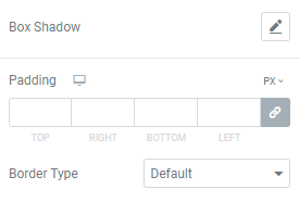
Box Shadow: Choose desired settings from the dropdown.
Spacing: Set spacing between tabs for desktop, tablet and mobile.
Padding: Set paddings for desktop, tablet and mobile.
Border Type: Choose the desired border type from the dropdown and set it.
Dividers
Width: Set the dividers width for desktop, tablet and mobile.
Color: Choose the dividers color.