Product Image Widget

Use the widget to display the product image.

Content

Image

product-image-image

Image Size: Choose the image size from the dropdown.

Alignment: Choose between Left, Center and Right image alignment.

Fallback image: Set the image to be used when no product thumbnail is found.

Image Link: Choose between None, Post, Media and Custom links. 

Caption: Choose the caption setting from the dropdown.

Object Fit: Choose the desired setting from the dropdown. The image will be resized to fit its parent container.

Image Overlay: Slide to YES to enable the image overlay. 

Style

Image

product-image-image-2

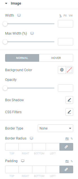
Width: Set the image width for desktop, tablet and mobile.

Max Width:  Set the image max width for desktop, tablet and mobile.

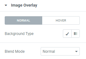
Background Color: Choose a Background Color (for Normal and Hover modes)

Hover mode allows to choose Hover Animation from the dropdown and set Transition duration, i.e. choose the amount of time to transition from one filter setting to the other when hovering over the image.

Opacity:Set the Image opacity.

Box Shadow: Choose desired settings from the dropdown.

CSS Filters: Use filters to set Blur, Brightness, Contrast, Saturation and Hue.

Border Type: Choose the desired Border Type from the dropdown and set it. 

Border Radius: Set a border radius to the Image.

Padding: Set the Image paddings for desktop, tablet and mobile.

Image Overlay

product-image-image-overlay

Background Type: Choose the background type between Classiс and Gradient for Normal and Hover modes and set it.

Blend Mode: Choose the Blend Mode from the dropdown.

Advanced

Set the Advanced options that are applicable to this widget