Product Images Widget
Content
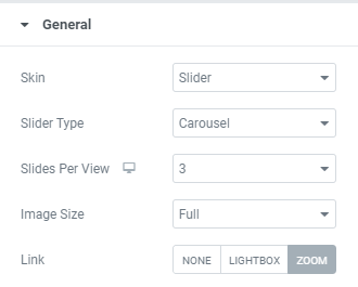
Skin: Choose between Slider, Grid and Anchor skins.
Slider skin allows users to choose between Carousel and Coverflow Slider Types and to choose the amount of Sliders per View for desktop, tablet and mobile.
When Carousel slider type is chosen you can choose a Slider effect between Slide, Cube, Fade and Flip.
Grid skin allows to set the number of Сolumns and to set the Gap between columns for desktop, tablet and mobile.
Anchor type allows users to choose between Left and Right Navigation positions.
All skin types allows to set:
Image size: Choose desired image size from the dropdown.
Link: Choose between None, Lightbox and Zoom, i.e. choose the image behavior on click/hover.
When Zoom is chosen you can also set Zoom Options.
For a Slider skin

For a Grid and Anchor skins
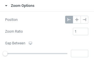
Position: Choose between Left, Inside and Right Zoom position.
Zoom Ratio: Set desired Zoom Ratio.
Gap Between: Set desired gap between Image and Zoom field.
Slider Options
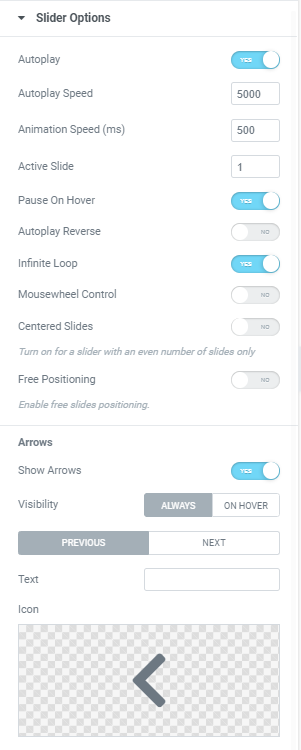
Autoplay: Slide to YES to enable Autoplay.
Autoplay Speed: Set desired speed here.
Animation Speed: Set how fast slides should slide.
Active Slide: Choose the slide that should be shown first.
Pause on Hover: Slide to YES to enable Pause on Hover.
Autoplay Reverse: Slide to YES to enable Autoplay reverse.
Infinite Loop: Slide to YES to enable Infinite Loop.
Centered Slides: Slide to YES to center slided.
Can be used for a slider with an even number of slides only.
Mouse Wheel Control: Slide to YES to slide slides with a Mouse wheel.
Free Positioning: Slide to YES to enable free slides positioning.
Arrows
Show Arrows: Slide to YES to show arrows and set them.
Thumbnails
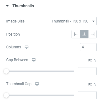
Image size: Choose desired size from the dropdown.
Position: Choose between Right, Bottom and Left positions.
Columns: Choose the amount of columns for desktop, tablet and mobile.
Gap Between: Set a gap between main image and thumbnails for desktop, tablet and mobile.
Thumbnail Gap: Set a gap between thumbnails for desktop, tablet and mobile.
Style
Slider Layout
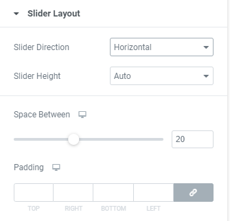
Slider Direction: Choose between Horizontal and Vertical directions
Slider Height: Set a slider height.
Space Between: Set a space between slider images.
Padding: Set paddings for desktop, tablet and mobile.
Slider Arrows
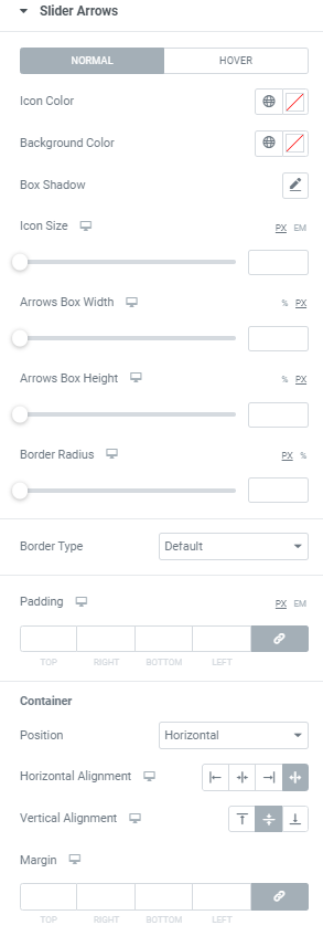
Icon Color: Choose Icon Color from a color palette or dynamic tags. (for Normal and Hover modes)
Background Color: Choose Icon Background Color from a color palette or dynamic tags. (for Normal and Hover modes)
Box Shadow: Choose desired settings from the dropdown. (for Normal and Hover modes)
Icon Size: Set Icon size for desktop, tablet and mobile.
Arrows Box Width: Set Arrows Box Width for desktop, tablet and mobile.
Arrows Box Height: Set Arrows Box Height for desktop, tablet and mobile.
Border Radius: Set Arrows Box border radius for desktop, tablet and mobile.
Border Type: Choose a Border Type from the dropdown and set it.
Padding: Set padding for desktop, tablet and mobile.
Container
Position: Choose between Horizontal and Vertical positions.
Horizontal alignment: Choose horizontal alignment between Start, Center, End and Space between for desktop, tablet and mobile.
Vertical alignment: Choose vertical alignment between Top, Center and Bottom for desktop, tablet and mobile.
Margin: Set margins for desktop, tablet and mobile.
Images
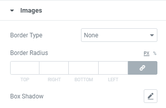
Border Type: Choose a Border Type from the dropdown and set it.
Border Radius: Set images border radius.
Box Shadow: Choose desired settings from the dropdown.
Advanced
Set the Advanced options that are applicable to this widget