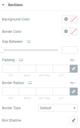
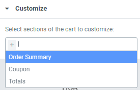
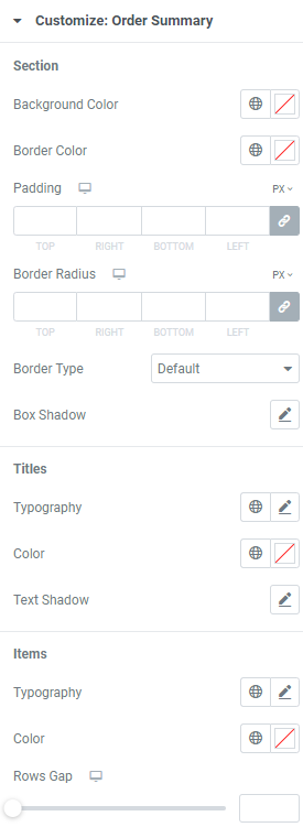
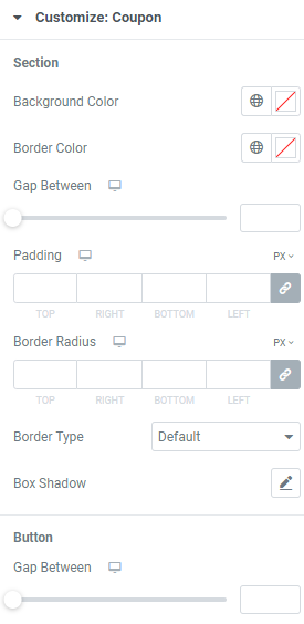
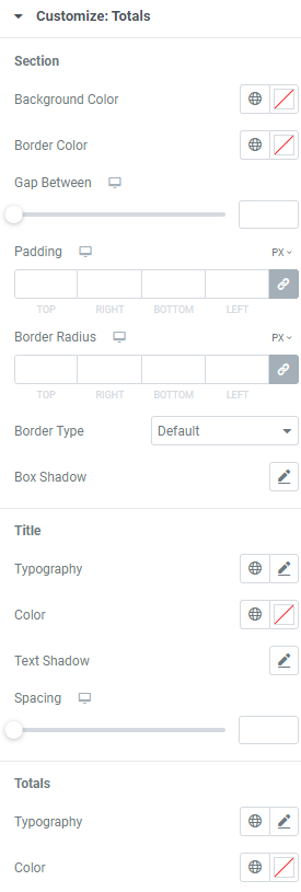
Section
Background Color: Choose background color.
Border Color: Set border color.
Gap Between: Set a gap between cart fields.
Padding: Set paddings for desktop, tablet and mobile.
Border Radius: Set a border radius for desktop, tablet and mobile.
Border Type: Choose the desired border type from the dropdown and set it.
Box Shadow: Choose desired settings from the dropdown.
Title
Typography: Set a Typography using settings from the dropdown.
Color: Choose the title color.
Text Shadow: Choose desired settings from the dropdown.
Spacing: Set spacing for desktop, tablet and mobile.
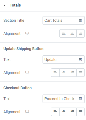
Totals
Typography: Set a Typography using settings from the dropdown.
Color: Choose the totals’ color.
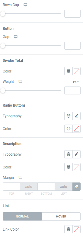
Rows Gap: Set a gap between rows for desktop, tablet and mobile.
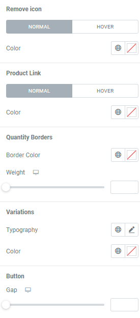
Button
Gap: Set a gap between button and totals.
Divider Total
Color: Choose the divider color.
Weight: Set the divider weight for desktop, tablet and mobile.
Radio Buttons
Typography: Set a Typography using settings from the dropdown.
Color: Choose the buttons’ color.
Description
Typography: Set a Typography using settings from the dropdown.
Color: Choose the description color.
Margin: Set margins for desktop, tablet and mobile.
Link
Set the link Color for Normal and Hover modes.