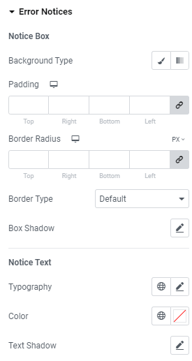
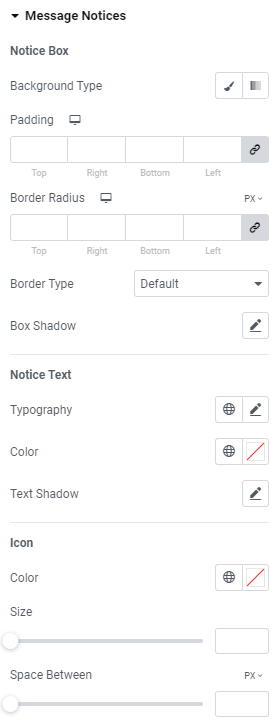
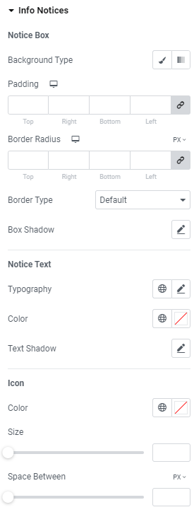
Notice Box
Background Type: Choose between Color and Gradient background type.
Padding: Set paddings for desktop, tablet and mobile.
Border Radius: Set a border radius for desktop, tablet and mobile.
Border Type: Choose the desired border type from the dropdown and set it.
Box Shadow: Choose desired settings from the dropdown.
Notice Text
Typography: Set a Typography using settings from the dropdown.
Color: Choose the text color.
Text Shadow: Choose desired settings from the dropdown.
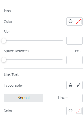
Icon
Color: Choose the icon color.
Size: Set the icon size.
Space between: Set a space between icon and text.
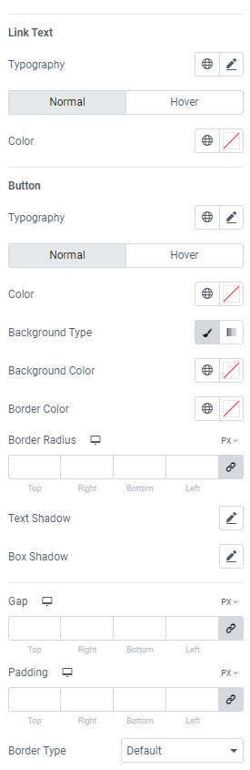
Link Text
Typography: Set a Typography using settings from the dropdown.
Color: Set the link color for Normal and Hover modes.
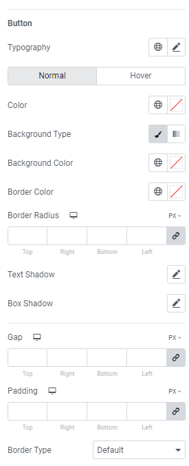
Button
Typography: Set a Typography using settings from the dropdown.
Color: Choose button color for Normal and Hover modes.
Background Type: Choose between Color and Gradient background type.
Background Color: Choose button background color.
Border Color: Choose border color.
Border Radius: Set a border radius for desktop, tablet and mobile.
Text Shadow: Choose desired settings from the dropdown.
Box Shadow: Choose desired settings from the dropdown.
Gap: Set a gap for desktop, tablet and mobile.
Padding: Set paddings for desktop, tablet and mobile.
Border Type: Choose the desired border type from the dropdown and set it.