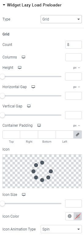
Grid
Count: Choose the number of icons that should be displayed.
Columns: Add the number of columns the icons should be shown for widescreen, desktop, tablet portrait and mobile portrait modes.
Height: Set the height for widescreen, desktop, tablet portrait and mobile portrait modes.
Horizontal gap: Choose Horizontal gap between elements for widescreen, desktop, tablet portrait and mobile portrait modes.
Vertical gap: Set Vertical gap between elements for widescreen, desktop, tablet portrait and mobile portrait modes.
Container padding: Add Container paddings for widescreen, desktop, tablet portrait and mobile portrait modes.
Icon: Choose the icon from Icon library or upload desired SVG.
Icon size: Set the icon size for widescreen, desktop, tablet portrait and mobile portrait modes.
Icon Color: Choose the icon color.
Icon Animation Type: Choose between none, Blink and Spin types.
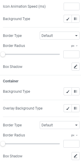
Icon Animation Speed (ms): Set the icon animation speed in milliseconds.
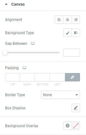
Background Type: Choose the background type between Classic and Gradient and set it.
Border Type: Choose the border type from the dropdown.
Border Radius: Set a desired border radius.
Box Shadow: Choose desired settings from the dropdown.
Container
Background Type: Choose the container background type between Classic and Gradient and set it.
Overlay Background Type: Choose the container overlay background type between Classic and Gradient and set it.
Border Type: Choose the border type from the dropdown.
Border Radius: Set a desired border radius.
Box Shadow: Choose desired settings from the dropdown.