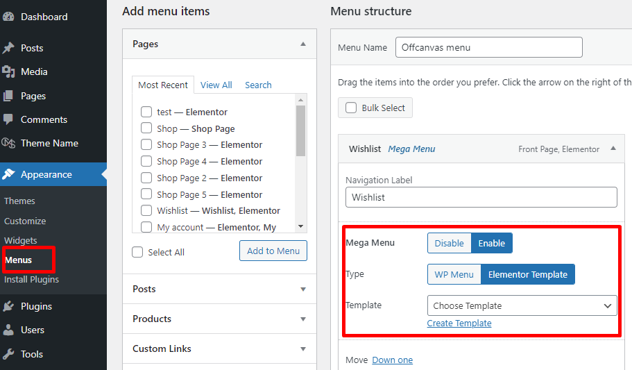
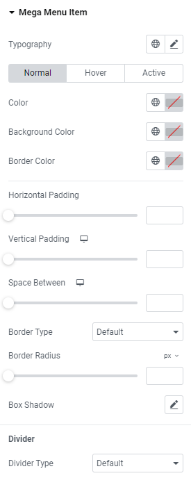
Typography: Set a Typography using settings from the dropdown.
Color: Set the desired color for normal, hover and active modes.
Background Color: Set the background color for normal, hover and active modes.
Border Color: Set the needed border color for normal, hover and active modes.
Horizontal Padding: Set items horizontal padding.
Vertical Padding: Set items horizontal padding for Desktop, Table Portrait and Mobile Portrait modes.
Space Between: Set a space between items for Desktop, Table Portrait and Mobile Portrait modes.
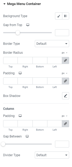
Border Type: Choose the desired border type from the dropdown and set it.
Border Radius: Set a border radius.
Box Shadow: Choose desired settings from the dropdown.
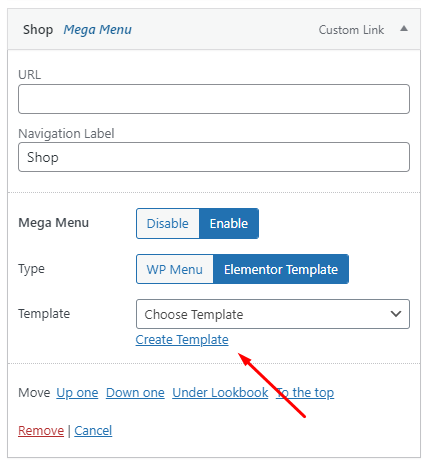
Divider
Divider: Choose a divider type from the dropdown and set it.
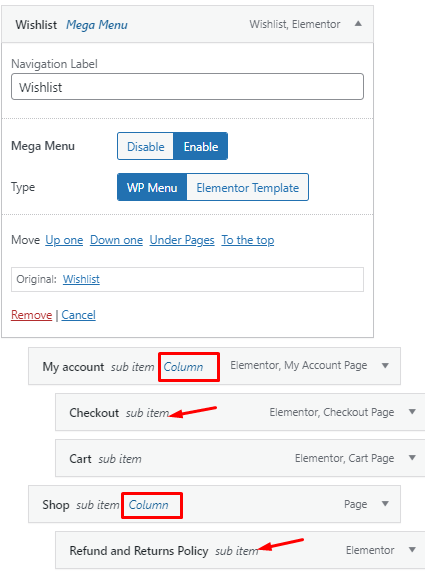
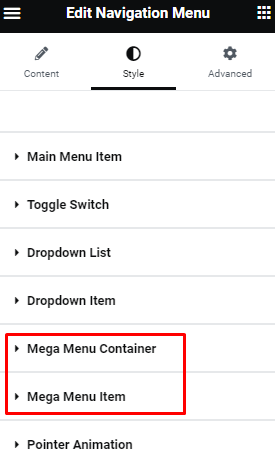
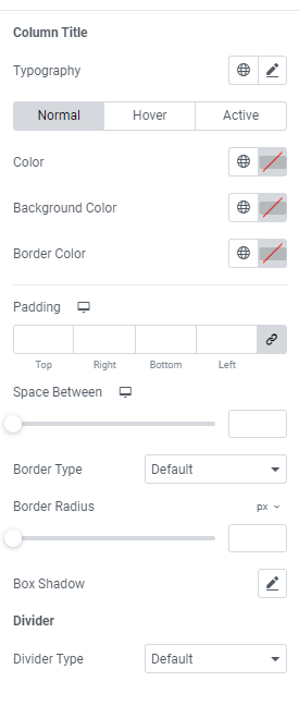
Column Title
Typography: Set a Typography using settings from the dropdown.
Color: Set the desired color for normal, hover and active modes.
Background Color: Set the background color for normal, hover and active modes.
Border Color: Set the needed border color for normal, hover and active modes.
Padding: Set paddings for Desktop, Table Portrait and Mobile Portrait modes.
Space Between: Set a space between titles for Desktop, Table Portrait and Mobile Portrait modes.
Border Type: Choose the desired border type from the dropdown and set it.
Border Radius: Set a border radius.
Box Shadow: Choose desired settings from the dropdown.
Divider
Divider: Choose a divider type from the dropdown and set it.