Slider Widget
Use the Slider Widget to easily embed sliders on your page.
Content
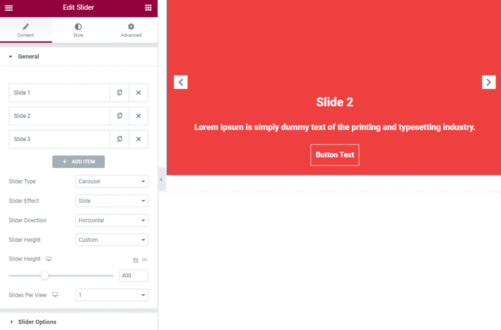
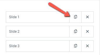
Add needed amount of items using +ADD ITEM button or copying items that are already added
On the Slide settings there are 3 tabs Main, Content and Position.
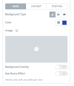
Main tab provides the following settings:
Background type: Choose a Background type between Classic, Gradient and Video and set it.
Classic Background type allows to set the desired Background color and add an Image and choose its Size from the dropdown for desktop, tablet and mobile.
Gradient Background type allows to choose Gradient Colors, set their Location and Type (Lineal or Radial)
Video Background type settings
Video Link: Add needed YouTube/Vimeo link or link to a video file (mp4 is recommended).
Start Time: Set the video start time (in seconds).
End Time: Set the video end time (in seconds).
Play Once: Slide to YES to play the video one time only.
Background Fallback: This cover image will replace the background video in case that the video could not be loaded.
Settings used for all background types
Background overlay: Slide to YES to enable Background overlay and set it.
Ken Burns Effect: Slide to YES to enable Ken Burns Effect.
Can be used with one slide per view only.
Content tab provides the following settings:
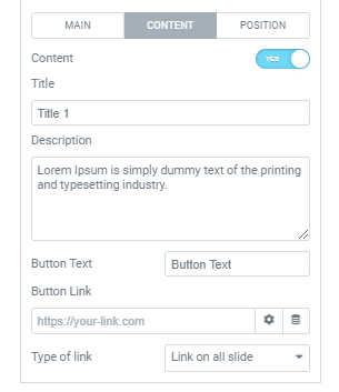
Content: Slide to YES to add a slide content.
You can add needed Title, Description, Button Text, Button Link and choose
Type of link between ‘Link on all slide’ and ‘Link on button’
Position tab provides the following settings:
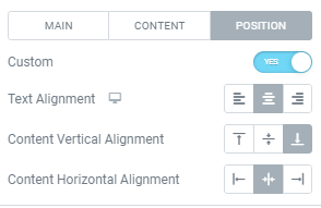
Custom: Slide to YES to enable Custom position and set it.
Here you can set:
Text alignment: Choose between Left, Center or Right alignment for desktop, tablet and mobile.
Content vertical alignment: Choose between Top, Middle and Bottom vertical alignment.
Content horizontal alignment: Choose between Left, Center or Right horizontal alignment.
Slider Type: Choose between Carousel and Coverflow types.
Carousel Slider Type allows to choose the Slider Effect from the dropdown.
Slides Per View: Set desired amount of slides for desktop, tablet and mobile.
Slider Options
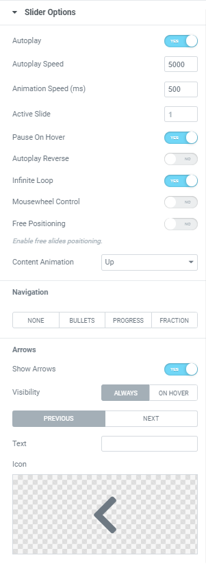
Autoplay: Slide to YES to enable Autoplay.
Autoplay Speed: Set desired Autoplay speed here.
Animation Speed: Set how fast slides should slide. (in milliseconds)
Active Slide: Choose the slide that should be shown first.
Pause on Hover: Slide to YES to enable Pause on Hover.
Autoplay Reverse: Slide to YES to enable Autoplay reverse.
Infinite Loop: Slide to YES to enable Infinite Loop.
Mousewheel Control: Slide to YES to slide slides with a Mouse wheel.
Free Positioning: Slide to Yes to enable free slides positioning. When this mode is enabled slides don’t have fixed positions, like usual scroller.
Content Animation: Choose the Animation from the dropdown.
Navigation: Choose slides’ Navigation between None, Bullets, Progressbar and Fraction.
Show Arrows: Slide to YES to show Arrows and set them.
Style
Slider Layout
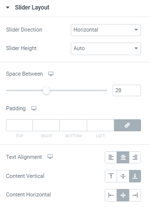
Slider Direction: Choose between Horizontal and Vertical directions.
Slider Height: Choose between Auto (for Horizontal direction only) and Custom height. When Custom slider height is chosen you can set desired Height manually.
Space Between: Set a space between slides for desktop, tablet and mobile.
Padding: Set slider paddings for desktop, tablet and mobile.
Text alignment: Choose between Left, Center or Right alignment for desktop, tablet and mobile.
Content vertical alignment: Choose between Top, Middle and Bottom vertical alignment.
Content horizontal alignment: Choose between Left, Center or Right horizontal alignment.
Slider Arrows
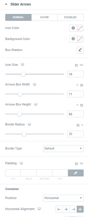
Disabled tab can be set only when the Infinite Loop option is activated.
Icon Color: Choose Icon Color from a color palette or dynamic tags. (for Normal and Hover modes)
Background Color: Choose Icon Background Color from a color palette or dynamic tags. (for Normal and Hover modes)
Box Shadow: Choose desired settings from the dropdown. (for Normal and Hover modes)
Icon Size: Set Icon size for desktop, tablet and mobile.
Arrows Box Width: Set Arrows Box Width for desktop, tablet and mobile.
Arrows Box Height: Set Arrows Box Height for desktop, tablet and mobile.
Border Radius: Set Arrows Box border radius for desktop, tablet and mobile.
Border Type: Choose a Border Type from the dropdown and set it.
Padding: Set padding for desktop, tablet and mobile.
Container
Position: Choose between Horizontal and Vertical positions.
Horizontal alignment: Choose horizontal alignment between Start, Center, End and Space between for desktop, tablet and mobile.
Vertical alignment: Choose vertical alignment between Top, Center and Bottom for desktop, tablet and mobile.
Margin: Set margins for desktop, tablet and mobile.
Slider Content
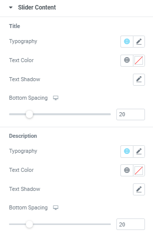
Title
Typography: Set Typography using settings from the dropdown.
Text color: Set a Title text color here.
Text Shadow: Choose desired settings from the dropdown.
Bottom Spacing: Set a spacing between Title and Description.
Description
Typography: Set Typography using settings from the dropdown.
Text color: Set a Description text color here.
Text Shadow: Choose desired settings from the dropdown.
Bottom Spacing: Set a spacing between Description and Button.
Slider Button
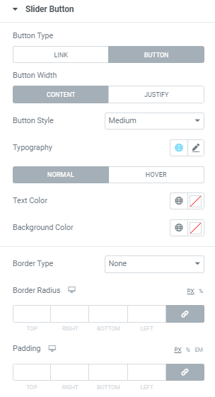
Button Type: Choose between “Link’ and “Button’ types.
When Link type is chosen you can set Typography and choose a Text Color for Normal and Hover modes.
When Button type is chosen you can set:
Button Width: Choose between Content and Justify.
Button Style: Choose desired style from the dropdown.
Typography: Set Typography using settings from the dropdown.
Text color: Set a Button text color here.
Background color: Set a Button background color here.
Border Type: Choose a Button Border Type from the dropdown and set it.
Border Radius: Set Border Radius for a Button for desktop, tablet and mobile.
Padding: Set paddings for desktop, tablet and mobile.
Advanced
Set the Advanced options that are applicable to this widget