Tabs Widget
Content
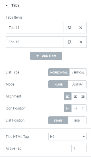
Click + ADD ITEM to add a Tab.
On a Tab’s settings choose a Content Type between Content, Section and Page and set it.
Please note that to use Section Content Type and Page Content Type you should create Section/Page template first. (find more information here)
List Type: Choose between Horizontal and Vertical Tabs’ position.
For Horizontal List Type choose the Mode between Inline and Justify.
For Vertical List Type set the List Width for desktop, tablet and mobile.
Alignment: Choose Tabs’ alignment between Right, Center and Left.
Icon Position: Choose between Left, Right or Top icon position.
List Position: Choose between Start and End positions.
Title HTML Tag: Set the Title’s tag to H1-H6, Div or Span.
Active Tab: Set the tab that should be opened by default.
Responsive
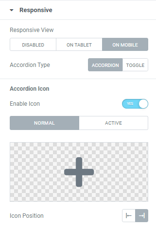
Set a Responsive View – choose a resolution where you want Tabs to rearrange: on Tablet or lower, on Mobile or Disable responsive.
Accordion Type: Choose between Accordion and Toggle.
Slide to YES to enable Accordion Icon and choose needed icons for Normal and Active modes.
Icon Position: Choose between Left and Right Icon position.
Widget Lazy Load
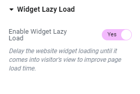
Enable Widget Lazy Load: Slide to YES to enable widget lazy load. Enabling the setting will delay the website widget loading until it comes into visitor’s view to improve page load time.
You can choose the settings you want in the widget’s Style tab, or set the Preloader view globally in the Site Settings to apply to all widgets with lazy loading enabled.
Style
Tabs List
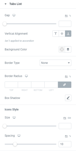
Gap: Set a Gap between Tabs list and content for desktop, tablet and mobile.
Vertical Alignment: Choose Tabs’ list vertical alignment between Top, Center and Bottom.
Background Color: Choose a Background Color from a color palette or dynamic tags.
Border Type: Choose a Border Type from the dropdown and set it.
Border Radius: Set a border radius to numbers.
Box Shadow: Choose desired settings from the dropdown.
Icons Style
Size: Set Icon size for desktop, tablet and mobile.
Spacing: Set a spacing between Icon and Title for desktop, tablet and mobile.
List Item
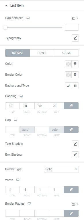
Gap Between: Set a Gap between Tabs for desktop, tablet and mobile.
Typography: Set a Typography using settings from the dropdown.
Color: Choose a Color from a color palette or dynamic tags. (for Normal, Hover and Active modes)
Border Color: Choose a Border Color from a color palette or dynamic tags. (for Normal, Hover and Active modes)
Background Type: Choose a Background type between Classic and Gradient.
Padding: Set padding for desktop, tablet and mobile.
Gap: Set gaps for desktop, tablet and mobile.
Text Shadow: Choose desired settings from the dropdown.
Box Shadow: Choose desired settings from the dropdown.
Border Type: Choose desired Border Type from the dropdown and set it.
Border Radius: Set a border radius to items.
Content Wrapper
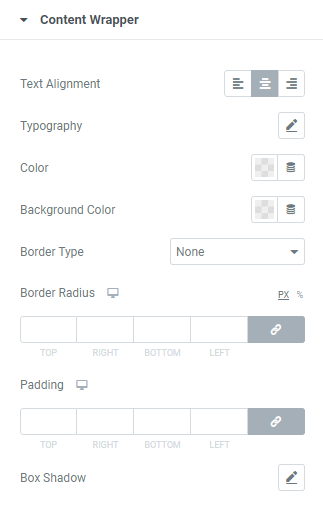
Text Alignment: Choose between Left, Center or Right text alignment.
Typography: Set a Typography using settings from the dropdown.
Color: Choose a Color from a color palette or dynamic tags.
Background Color: Choose a Background Color from a color palette or dynamic tags.
Border Type: Choose desired Border Type from the dropdown and set it.
Border Radius: Set a border radius to content wrapper.
Padding: Set padding for desktop, tablet and mobile.
Box Shadow: Choose desired settings from the dropdown.
Pointer Animation
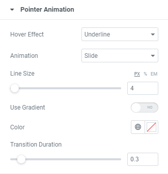
Hover effect: Choose Hover effect from the dropdown.
Animation: Choose Animation from the dropdown.
Line size: Set a Line size here.
Use Gradient: Slide to YES to enable gradient and set it.
Color: Choose a Pointer color from a color palette or dynamic tags.
Transition duration: Set the amount of time to transition from one filter setting to the other when hovering over the Title.
Widget Lazy Load Preloader Type Icon
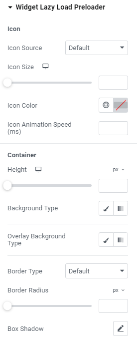
Icon
Icon Source: Choose default or custom icon.
Icon Size: Set the icon size for widescreen, desktop, tablet portrait and mobile portrait modes.
Icon Color: Choose the icon color.
Icon Animation Speed (ms): Set the icon animation speed in milliseconds.
Container
Height: Set the container height for widescreen, desktop, tablet portrait and mobile portrait modes.
Background Type: Choose the container background type between Classic and Gradient and set it.
Overlay Background Type: Choose the container overlay background type between Classic and Gradient and set it.
Border Type: Choose the border type from the dropdown.
Border Radius: Set a desired border radius.
Box Shadow: Choose desired settings from the dropdown.
Widget Lazy Load Preloader Type Grid
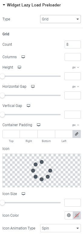
Grid
Count: Choose the number of icons that should be displayed.
Columns: Add the number of columns the icons should be shown for widescreen, desktop, tablet portrait and mobile portrait modes.
Height: Set the height for widescreen, desktop, tablet portrait and mobile portrait modes.
Horizontal gap: Choose Horizontal gap between elements for widescreen, desktop, tablet portrait and mobile portrait modes.
Vertical gap: Set Vertical gap between elements for widescreen, desktop, tablet portrait and mobile portrait modes.
Container padding: Add Container paddings for widescreen, desktop, tablet portrait and mobile portrait modes.
Icon: Choose the icon from Icon library or upload desired SVG.
Icon size: Set the icon size for widescreen, desktop, tablet portrait and mobile portrait modes.
Icon Color: Choose the icon color.
Icon Animation Type: Choose between none, Blink and Spin types.
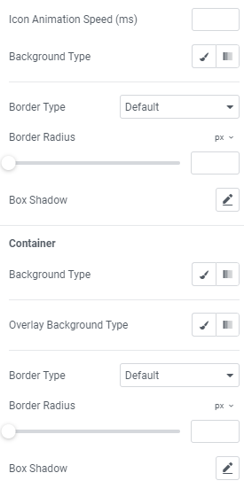
Icon Animation Speed (ms): Set the icon animation speed in milliseconds.
Background Type: Choose the background type between Classic and Gradient and set it.
Border Type: Choose the border type from the dropdown.
Border Radius: Set a desired border radius.
Box Shadow: Choose desired settings from the dropdown.
Container
Background Type: Choose the container background type between Classic and Gradient and set it.
Overlay Background Type: Choose the container overlay background type between Classic and Gradient and set it.
Border Type: Choose the border type from the dropdown.
Border Radius: Set a desired border radius.
Box Shadow: Choose desired settings from the dropdown.
Advanced
Set the Advanced options that are applicable to this widget