Site Logo Widget
Use the Logo Widget to easily embed Logo on your site.
Content
Type: Choose the Logo type between Image, Text and Both.
Alignment: Choose between Left, Center and Right alignment.
Image Logo Type
Source: Choose between Website logo and Custom image.
When a Custom image is selected you can choose the Image type between Image and Icon.
Retina Logo image: Add Retina Logo image here.
To add a Website Logo proceed to the Site Settings – General – Logo tab.
Please note that you can add the Second Logo Image that will be applied when using the Mode Switcher .
Text Logo Type
Title
Title Form: Choose between Default and Custom. (here you can add your Custom Logo text).
When Custom is selected you can add the custom title.
Subtitle
Subtitle: Choose between Tagline, Custom (here you can add your Custom Logo Subtitle text) or None.
Text and Image Logo Type combines the settings of both Image Logo Type and Text Logo Type.
Additional Options
Link: Choose the Logo link. The choice is between None, Home page URL and Custom URL.
Open in new window: Slide to YES to open a page in a new window.
The setting can be used when the Home page URL link is selected.
Add nofollow: Slide to YES to add nofollow attribute to the link.
The setting can be used when the Home page URL link is selected.
Remove link on Front page: Slide to YES to remove link on the Front page.
Style
Image
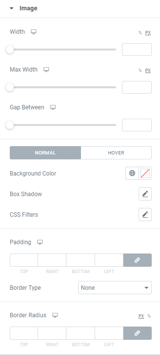
Width: Set the logo image width for desktop, tablet and mobile.
Max Width: Set the logo image maximum width for desktop, tablet and mobile.
Gap Between: Set the gap between logo image and text for desktop, tablet and mobile.
Background color: Set the Background color via color palette or dynamic tags. ( for Normal and Hover modes)
Box Shadow: Choose desired settings from the dropdown.( for Normal and Hover modes)
For Hover mode you can also set Transition Duration, i.e. the amount of time to transition from one filter setting to the other when hovering.
CSS Filters: Use filters to set Blur, Brightness, Contrast, Saturation and Hue.
Padding: Set the Padding for desktop, tablet and mobile.
Border Type: Choose Border Type from the dropdown and set it.
Border Radius: Set the Border Radius for desktop, tablet and mobile.
Title and Subtitle
Vertical Alignment: Choose Title and Subtitle vertical alignment between Top, Middle and Bottom.
Title Alignment: Choose the Title alignment between Left, Center and Right.
Title
Typography: Set a Typography using settings from the dropdown.
Text Shadow: Choose desired settings from the dropdown.
Color: Set a color via color palette or dynamic tags. ( for Normal and Hover modes)
For Hover mode you can also set Transition Duration, i.e. the amount of time to transition from one filter setting to the other when hovering.
Subtitle
Gap Between: Set a gap between Title and Subtitle.
Typography: Set a Typography using settings from the dropdown.
Text Shadow: Choose desired settings from the dropdown.
Color: Set a color via color palette or dynamic tags. ( for Normal and Hover modes)
For Hover mode you can also set Transition Duration, i.e. the amount of time to transition from one filter setting to the other when hovering.
Advanced
Set the Advanced options that are applicable to this widget